
Customizing Twenty Sixteen: Four Takes on Our Annual Theme
From personal websites to food blogs, Twenty Sixteen offers a pristine canvas for your design touches.
Every year we release an annual flagship theme as a blank canvas for bloggers, artists, professionals, and business owners. This year’s creation, Twenty Sixteen, is a gorgeous theme that celebrates a classic WordPress layout yet injects it with new energy and precise, minimalist flare.
Twenty Sixteen‘s customization options allow it to support any type of site — from a traditional blog to a professional web page. Here are four sites that caught our eye.
Shakespeare Confidential
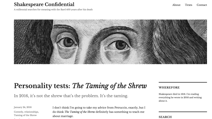
Some of you might know blogger John Kelly from his superb etymology blog, mashed radish. John has embarked on a new adventure this month. Since 2016 marks the 400th anniversary of William Shakespeare’s death, he intends to read the Bard’s entire corpus of plays and poetry by year’s end, and chronicle the journey on his blog.
He chose Twenty Sixteen for this project, and the theme’s crisp typography and nods to print culture work perfectly with his topic — check out the neat post intro which gives readers a hint of the post’s content (see screenshot above: “In 2016, it’s not the shrew that’s the problem. It’s the taming.”), or the magazine-like pull quotes (below).

A few other well-chosen elements, like a clean serif font (Libre Baskerville) and a custom header image based on a famous Shakespeare etching, come together to create an unobtrusive but memorable look.
YINKABOKINNI
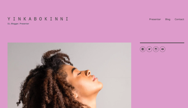
A pop of color, a punchy tagline, strategically positioned social icons: with just a few brushstrokes, D.J. and radio presenter Yinka Bokinni has crafted a homepage full of personality.
Yinka, a UK-based music and fashion lover, hosts a morning show at London’s Rinse FM, and you sense something of that early-morning, big-city vibe in the site’s design, from the shocking pink custom background to the slender sans-serif fonts she uses (like Droid Sans Mono in the site’s title).
Yinka has opted for a static front page, but the site’s other sections — her blog and contact info, for example — along with her other social profiles are all one click away thanks to the well-placed custom menu and Social Media Icons Widget.
Lucão

Even if you don’t read Portuguese, Brazilian poet Lucão’s blog is a hymn to the virtues of minimalism — in writing as well as in design.

Lucão — real name Lucas Brandão — has cultivated a huge audience on social media, with more than 300,000 followers on Instagram alone. His blog — where he gathers all his handwritten, aphorism-length poems — is a comfortable hub where readers can explore his deep archives (he’s been publishing here for almost a decade). The black-and-white aesthetic of the poems work especially well against the backdrop of Twenty Sixteen, whose clean lines and focus on readability let the words speak for themselves.
Three Hour Brunch Friend
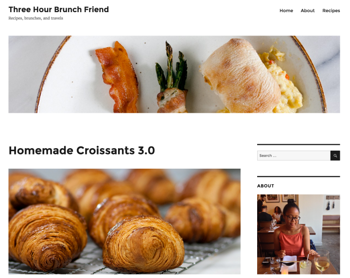
In our book, any food blog with “brunch” in its name is already ahead of the curve; Patricia, a Toronto, Canada-based food blogger went a few steps further and used Twenty Sixteen to create an inviting, bright space for her recipes.

Patricia’s blog demonstrates how the theme’s out-of-the-box look, including its default font and white background, are the perfect foundation for lovely photos and fun food writing. She’s added a handful of widgets — an Image Widget to introduce herself, a Categories Widget for easy navigation, an Instagram Widget for even more eye candy — and let the theme (and a winning custom header image featuring bacon) take care of the rest. We particularly liked how her wider images overhang the text (see the screenshot to the left), one of Twenty Sixteen‘s signature touches.
Have you added your own tweaks to Twenty Sixteen? Have you seen other beautiful customizations of the theme? Let us know in the comments.
- January 27, 2016
- Customization, Design, Themes, WordPress.com

I wish that you could make the text on any theme 100% of any color you choose without having to pay for the customization upgrade. Making a blog readable should be a basic feature.
LikeLiked by 2 people
The font color on all themes is selected by the theme’s designers for its optimal readability — I wholeheartedly agree that readable text is crucial.
Sometimes, the ideal font color for a site might change when a blogger chooses to switch to a different background color, in which case the Custom Design feature (part of our Premium plan) allows you to change the font color according to your site’s specific needs.
LikeLiked by 1 person
Can’t you do this with the Custom CSS option in Jetpack?
LikeLiked by 2 people
You can, but the site in question is a WordPress.com one, not a self-hosted site with Jetpack.
LikeLiked by 1 person
Got it. I wasn’t certain from the original post which version was under discussion.
LikeLike
Loving this new theme as well!
LikeLiked by 2 people
Love it when you guys give us “samples” of themes. Inspirational and helpful. Thank you!
LikeLiked by 2 people
Cool…I recently started my blog. I will be looking into this. Thanks!
LikeLiked by 1 person
Nice to see a Brazilian guy there! I didn’t Lucão’s website, gonna check it out for sure
LikeLike
Why must the “Blog at WordPress.com” footer credit line appear twice, at the bottom of the front page of the Twenty Sixteen theme?
LikeLike
It normally doesn’t appear twice, but in your case it’s not about the theme, but rather about infinite scroll. Your site currently has infinite scroll enabled — meaning that visitors scrolling down should see new posts loaded. Since you currently have two posts, the “bottom” of the page is visible, which is where the second footer comes in. If you disable infinite scroll the extra footer will disappear with it (and you can always switch it back on when you have a higher number of published posts). To disable infinite scroll, go to your dashboard’s Reading Settings menu, which you can find here: https://wholeplantfood.wordpress.com/wp-admin/options-reading.php.
LikeLike
Thank you for this post! I find it very useful 🙂
LikeLike
Thanks for this post! Really useful!
LikeLiked by 1 person
Hi there, I’m in love with this theme. I’m using on my Self hosted WordPress site http://addictionrecoverylab.com/ and WordPress.com https://addictionrecoverylab.wordpress.com/
I have a question; on my self hosted site the Addiction Recovery Lab header logo drops well bellow the top of the page wilts the WordPress.com site the header logo is positioned as it should be.
Any way you can help me figure out a work around to this issue.
Much appreciated,
Byron in Calif
LikeLiked by 1 person
Since the issue appears on your self-hosted site, your best bet is to ask the theme experts over at the WordPress.org Themes and Templates support forum. They’re best qualified to help you find a solution.
LikeLiked by 1 person
That was very helpful, I changed the theme today itself!
LikeLiked by 1 person
I’m enjoying twenty sixteen. The black border was the thing that gave me the inspiration to do the same to the photos I upload to keep a standard to the theme.
Also like the fonts and the placement of feature image and excerpt, – particularly the light grey colour that gives a difference, and elegance without dominating the page.
The only thing I haven’t worked out is the Use of the Sidebar. I’m not sure I want to keep it on the page, but can’t figure out where to put the collection of info.
Enjoyed Blogging 101 and it helped me make much more use of the community.
http://www.birdsaspoetry.com.
LikeLike
Thanks for the kind words!
You do have quite a few widgets in the sidebar — and you have a couple of options that you can mix and match. You could prune a few widgets after deciding which ones are the most important ones for you. You could turn some of them — maybe the more text- or image-heavy among them? — into pages that you could link to in your custom menu. And you could spread the love by adding more widget areas — in Twenty Sixteen the footer contains two additional widget areas for you to use (note that activating them will automatically disable infinite scroll on your site, which is currently enabled).
I hope this helps!
LikeLike
Dear Sirs A colleague and I have a blog page called prsbhtblog. Recently a number of unsolicited adverts have appeared on our page including ADDIDAS, another for a freelance writer and a third untitled advert trying to sell vegetables. Is this a new WordPress policy and if so are we entitled to any of the advertising revenue? Or is this ‘outsiders’ hacking into wordpress? Because of some of the themes and topics we are writing about we feel that we do not want to be associated with any type of outside advertising. We look foreword to receiving your reply. Chris Ellis and J Gordon
Date: Wed, 27 Jan 2016 20:16:35 +0000 To: gpoa@hotmail.co.uk
LikeLike
In order to keep free featured free on WordPress.com, we sometimes display ads from third parties on your site. You can eliminate ads altogether by purchasing a WordPress.com Premium or WordPress.com Business plan; you can read more about ads here: https://wordpress.com/support/no-ads/
LikeLike
Superb article, and I’m trying to utilise Twenty Sixteen to its fullest potential.
However, as a Stroke survivor, I often get confused.
Could you look at my site keithosola.com and suggest practical ways that I might improve it?
I simply love the theme, and could really do with some genuine hand-holding (as I want to learn).
Simply cannot make up my mind about upgrading (unless they’re are significant benefits, and need to watch the pennies.
Do please have a look, if you’ve the time, as I’ve tried to put a lot of work into it.
Thank you
LikeLike
Hi Keith! Given the format and purpose of this comments section, this is probably not the best venue for others to give you meaningful feedback on your site. I heartily recommend that you either join an upcoming Blogging U. course, where both staff and fellow bloggers are around to provide as much feedback as you’ll ever want (and then some!), or, for something a bit more quick and casual, visit our weekly Community Pool posts, where bloggers seek advice and feedback from other members of the community.
LikeLike
Hi Ben
My sincere thanks for your feedback.
I recognise that it probably wasn’t the best forum to ask your opinion, and I apologise for that.
I’d love to join the Blogging U course, as I need assistance and I very much want to learn.
Thanks for getting back to me, I really appreciate it.
Keith
LikeLike
I’m a huge fan of twenty sixteen and how customizable it is. Very cool to how it’s used so differently by these 4 different sites.
On my self-hosted blog I switched to twenty sixteen. Some of my posts are very long so here’s my take on customizing it to make reading lengthy text as easy as possible:
http://www.filterjoe.com/2015/12/23/grinch-changed-to-the-twentysixteen-wordpress-theme/
LikeLike
Thanks! I also use Twenty Sixteen and have used the WordPress.com default theme since Twenty Fourteen. I have made each theme my own using CSS. I share my code on the blog. Both Twenty Fifteen & Twenty Sixteen are up. They are under my blog menu. I take lots of pictures and display than on my blog. I luv the default theme and think Twenty Sixteen is the best so far. Thanks again!! –jim artis [a.k.a. jalexartis]
LikeLiked by 1 person
Thanks @benhuberman . I have a question. I’m glad you answered.Are you coming on node.js consistent theme? Faster blogs. Happy bloggers.
LikeLike
Hi there! We aren’t running any Node-based themes, but Collections runs on Backbone and we are very interested in the future of JavaScript-based themes, so who knows what the future holds. 🙂
LikeLike
I recently used twenty sixteen theme. It’ s very beautiful. But I have an objection: couldn ‘t the designer make larger the main column (where the post embeded)? this choice is very annoying, very annoying! In blogger there is no such a problem. I ‘m thinking leaving wordpress soon.
LikeLike
Thanks for the feedback! Twenty Sixteen is but one of hundreds of themes (most of them free) we offer for you here at WordPress.com — if you have a specific design requirement and wish to avoid Custom CSS (which is part of the WordPress.com Premium plan), I recommend browsing our Theme Showcase for other alternatives that meet your needs better.
LikeLike
Twenty Sixteen’s a huge improvement, very clean and usable with a stack of widgets, and the left-side date/category/comments links make posts more usable without scrolling down, scrolling up.
One thing, it would be nice to have another color scheme with black text on very light grey, sepia, or the blue of this blog (#f0f4f6), rather than stark white, dark grey, black, candy-apple red, and warning yellow; the last two are basically jokes, nobody’d use that, right? I’m not opposed to buying premium, but this seems like a minor thing to upsell on.
http://markrollsdice.wordpress.com/
LikeLike
These show how important it is to understand colour (color) coordination too. They work because the design is thought out in much more than layout. Having an eye for what colour combinations work and what don’t is half the battle.
LikeLike