Upgraded Stats and Navigation Enhancements
Whether you have one blog or multiple sites, we hope you enjoy these updates to the WordPress.com interface.
We’ve been updating WordPress.com to make it faster and more powerful behind the scenes. We’ve now introduced some changes to the WordPress.com interface as well, making website, blog, and content creation more intuitive and consistent across devices. Here’s a roundup of some of the enhanced functionality that you’ll see in WordPress.com starting today, with more updates coming next week — stay tuned!
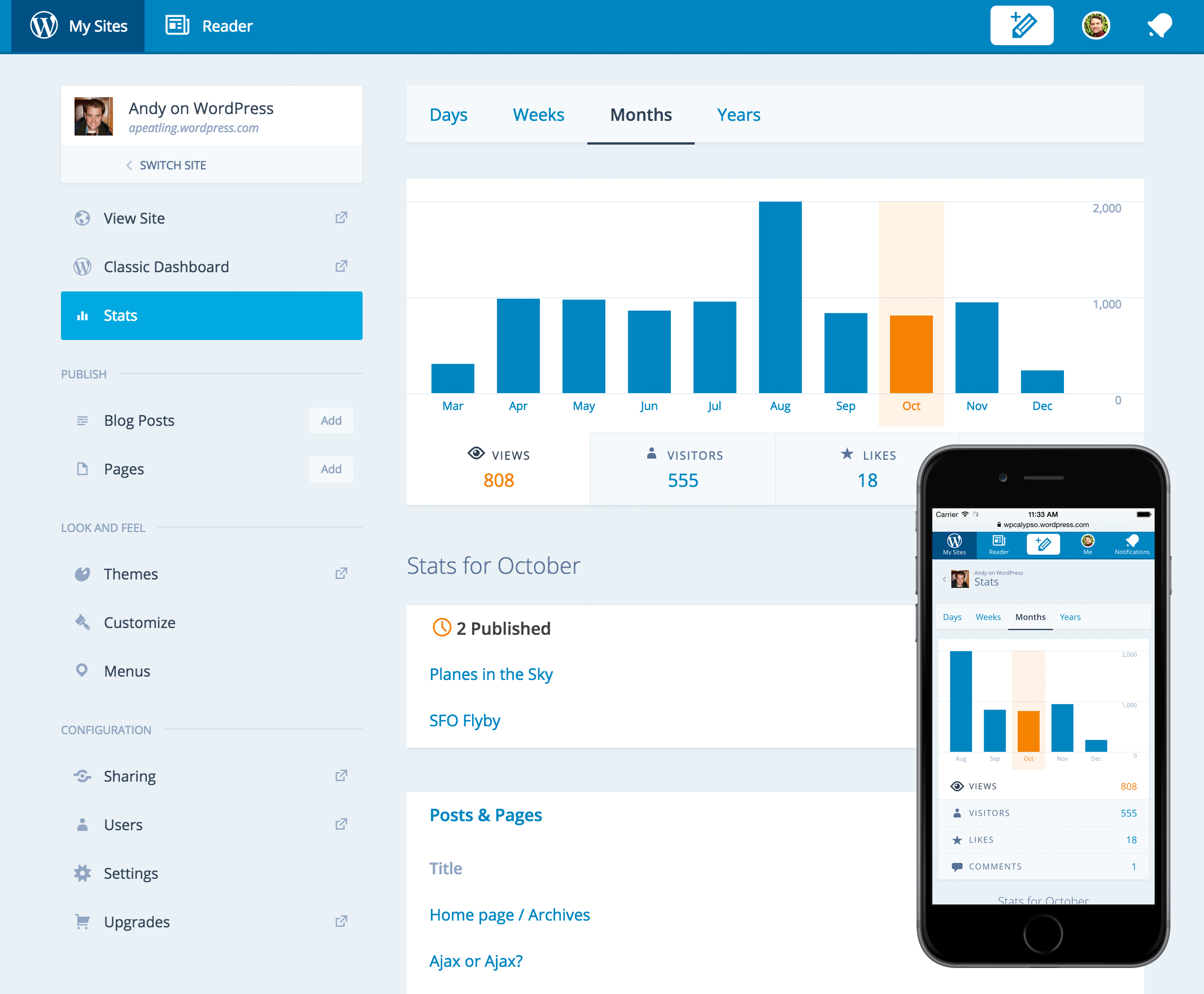
Upgraded stats
Mobile-friendly navigation
Millions of people use WordPress.com on mobile devices, and to ensure that our mobile users have a first-class experience, we gave the WordPress.com navigation interface a little love. It’s responsive across devices, and its simpler, more streamlined design lets users find or create amazing content from anywhere.
My Sites updates
My Sites is the hub for creating blog content, organizing website pages, adjusting look and feel, and managing any and all WordPress.com websites and blogs tied to a user’s account. We announced initial updates to My Sites recently, and have since acted on wonderful user feedback to make My Sites more streamlined. Your sites will now appear in an easy-to-search sidebar, and you’ll have access to stats, posts, and themes for any and all of your sites with fewer clicks.
My Profile
My Profile is the new destination for managing account settings. Get there by clicking on your Gravatar picture. In addition to handling administration settings like basic account info and billing history, users can add Gravatar images, view WordPress.com milestones and achievements, or tap into social networks to expand their blogging community.
Support documentation is also accessible from My Profile for those who seek more guidance, and friendly live support is just a click away when our Happiness Engineers are available.
Onward!
We’re continuing to make WordPress.com faster, more powerful, and more user-friendly across devices for all our users — those with a single blog and those with multiple WordPress sites. To that end, we are listening to user feedback and rolling out updates when they’re ready. Give the new navigation and enhanced stats a whirl, and let us know what you think!
- December 9, 2014
- Admin Bar

Like it so far…very clean design and it runs really smooth.
LikeLiked by 6 people
So far I am finding it a lot smoother experience with the new upgrades. Thank you!
LikeLiked by 6 people
The changes sound great! Can’t wait to experience them. I don’t use my WordPress site as much as I would like to; I have too much else to do with writing and teaching and being a mom. But when I teach my Grade 7 media classes about blogging, I tell them that WordPress is the best.
LikeLiked by 4 people
New graphs show fewer days, and no “All Time” summary tabs. No marks for weekdays/weekends. Can’t see an entire year in Months mode. No world map
LikeLiked by 32 people
Agreed. The stats page looks like version 1 of the old one and what’s the purpose of the wide menu bar? The space could’ve been used for more days in stats and the menu could’ve been just a few icons at the top. But some of the improvements are good (like the ability to compare comments/likes from day to day).
LikeLiked by 12 people
Thanks for letting us know the things you prefer about the old stats page.
Did you know that you can still access the map by clicking on the title of that module? Click on “Countries” and a new expanded view, which includes the map, will appear.
Your feedback is valuable to us, and we’ll take it into account as we further improve the stats experience.
LikeLiked by 8 people
Certainly, the new layout upgrade is good and provides most of the options at one place! But, previous stats is better than new stats.
LikeLiked by 27 people
I have been waiting for this update for a while actually. Now I can finally enjoy it. Thank you again WordPress! 🙂
LikeLiked by 3 people
Wow very clean design and it’s been a good treat to eyes 🙂
LikeLiked by 3 people
The new stats page offers less information and is harder to navigate. It is nether faster nor an improvement over the former stats page.
LikeLiked by 30 people
I can’t find the mobile app update on the App Store yet, was wondering if it’s updated yet?
Anna x
LikeLiked by 2 people
Hi Anna! The changes we released to WordPress.com make accessing WordPress.com via the web browser on your mobile device a much more enjoyable experience. I’d suggest giving the changes we’ve made a shot in your browser.
No news on updated mobile apps yet, but stay tuned 😉
LikeLiked by 1 person
It sounds like WP did a lot of work to improve our experience, and yet, I prefer the classic dashboard.
LikeLiked by 53 people
It isn’t better. It isn’t more useful. It contains far less information and is clearly aimed at newbies. For those of us who have blogs that are years old, this provides nothing useful. Pretty isn’t BETTER. It’s just pretty. And endless scrolling is not better navigation. It’s NO navigation.
LikeLiked by 36 people
This is something really nice.
LikeLiked by 3 people
I hate to be contrary, but I don’t think this is an improvement at all. It displays less information and it causes you to have to scroll and scroll to be able to see what was more easily viewed on the old stats page. I posted about it here, if you’re interested in my thoughts. http://mindfuldigressions.com/2014/12/08/if-it-aint-broke-fix-it-anyway/
If you want to have an easy to use “stats lite” page with basic information, a sort of “stats at a glance” page, that’s fine. But then let me download my own stats into an Excel file or a CSV format so I can run my own reports, create my own charts, do my own deep dive analytics, that would be great. I’d be a happy camper. But until you do that. at least give me a stats page with meat on it.
LikeLiked by 35 people
What you call ‘enhancements’ are not always perceived that way by users. Why change ‘Dashboard’ to ‘WP Admin’? This is just confusing! The page is still called Dashboard yet is identified on the dropdown as WP Admin. I’m sorry to complain but it is hugely irritating to get used to navigating one way and have it change for no apparent rhyme or reason.
LikeLiked by 15 people
I really like these updates! They really improve navigating the site and kind of make me want to dust off my poor abandoned blog!
LikeLiked by 4 people
Thank you very much.
LikeLiked by 2 people
I notice a lot shallower time depth in the stats – I like being able to look back more than a year to see seasonal changes and the like. I am going to miss that unless there is a work around I have not discovered yet.
LikeLiked by 7 people
How do I sign-out now?
LikeLike
To sign out, click on your Gravatar in the blue toolbar then click the “Sign Out” link next to your username in the left sidebar.
LikeLiked by 2 people
Personally, I like the idea of 1/3 of my screen being used for a redundant menu bar!
LikeLiked by 21 people
Love it guys! Thanks so much for the ongoing effort to improve it for bloggers and for incorporating feedback. Thumbs up for this!
LikeLiked by 3 people
ooh lala! i’m loving this!!
LikeLiked by 1 person
Um, I like the old one, it’s more compact. This is faster, but if just compress it a bit, it’ll be perfect.
LikeLiked by 12 people
Just the stats page
LikeLiked by 2 people
I’m SO happy about the change, been trying to change my photo from silly avatar mode for almost 3 months now w/ no success. It took only a few minutes this time & it actually worked! Thank you! 😀
LikeLiked by 3 people
Oh, this is really a good news, we need to improve through our experiences to get better. I will enjoy it immediately. Thanks a lot!
LikeLiked by 1 person
They really improve navigating the site and kind of make me want to dust off my poor abandoned blog!
LikeLiked by 3 people
Am I the only person who gets annoyed with all the changes? What was wrong with leaving everything the way it was. If it’s not broke, why fix it?
LikeLiked by 51 people
come on, we live in an age of unnecessary updates every 6 months or so.
LikeLiked by 12 people
If it were every six months, that would be more bearable, but they are way more often. They’ve changed the picture placement editing yet again.
LikeLiked by 2 people
keeps us on our toes 😉 I didn’t even notice that one, I think I thought it was the last change since it changes so often. The good thing is the classic dashboard is still accessible.
LikeLiked by 3 people
Lovley
LikeLiked by 2 people
I am proud of the new clean design. I absolutely love it. It is superb. Thanks for bringing this to us.
LikeLiked by 1 person
Not my taste. But then I must admit I dislike streamlined stuff. It’s also a shame that you give your mobile users a first-class experience while you don’t care about your desktop users anymore. All the latest design changes might make it more accessible on mobile devices but on a desktop system it looks to me like a horrible experience. There are several usability issues, it’s too streamlined and downgraded now, and it looks way too mobile. I hope you can take that critique because it’s my experience.
LikeLiked by 29 people
I don’t think that was an improvement. Lots of scrolling and extra clicks to get where I want to be. Running 12 public and private blogs, I’d prefer an extra ‘my sites’ page, the current one being only a stats page.
LikeLiked by 24 people
I don’t use a tablet, hope you allow to use the old stats page at user’s will
LikeLiked by 13 people
WordPress does many wonderful things (some of the new themes for example have been really excellent) but this seems to be aimed at novice users with only one site. It’s now more difficult to find my other sites and instead of a quick at a glance view you now have to wade through lots of unnecessary text which distracts from the statistics. I’m afraid on this occasion I think this is a backward step for me. It’s a shame there isn’t the option to stick with the old layout.
LikeLiked by 19 people
Really cool!
LikeLiked by 1 person
aww the new stats page is too confusitn. I often choose the new over the old, but this new stats is not as good as the old one. In the old one all needed information is in one page, and I can read instantly at one glance. With the new stats, I have scroll down to find the section I need. It’s inconvenient. I would love you change the stats page, but not this way.
LikeLiked by 16 people
I much prefer the old one. Most of what I need to see is on a single screen. I would prefer not to have to scroll to get an overview. The menu on the left seems unnecessary. I can however see that it might work better on mobile devices. All my admin is however done from my PC.
LikeLiked by 19 people
I really like these updates! This is something really very nice.
LikeLike
hey i have a question,how do you sign out???????
LikeLiked by 3 people
Click your avatar in the upper right corner of the screen, then find Sign Out in the left sidebar right under the enlarged version.
LikeLiked by 1 person
Thanks a lot!!!!!!!!
LikeLiked by 1 person
Hello. Could you please tell me where is the logout in this new version? I don’t see it.
Thanks Bea
LikeLiked by 3 people
If you hit your avatar in the top right, you’ll see a logout link in the left column of the new page.
LikeLike
Thank you very much. Now I can logout. I wish you a nice Christmas. Be a
LikeLike
What happened to the world map on the stat page of who was visiting your site? That was my favorite part!
LikeLiked by 11 people
Click on the heading that says “Countries” to see the map.
LikeLike
I am not pleased with such an abrupt change. I personally liked the old stats page and other settings. If you could give users the option to keep the old settings if they choose, that would be much better. Please, WordPress, before you change things, tell us beforehand! Thank you.
LikeLiked by 21 people
This sounds really helpful. Thanks.
LikeLike
wow!!!
LikeLike
You do say you want to keep a user friendly on ALL devices. It is not so much it had to be faster unless one does not have time to blog otherwise.
It is cluttered unless you are using a phone or tablet. The over powerful menu doesn’t make it faster it makes it hideous and unworkable.
It was better when most items where on the dashboard where it belonged as most was not and isn’t needed to ma post.
No t does not make it better for me who makes his est posts on a PC. Taking the time and no need to rush.
And now even more time is needed to click through all hose links. It may be aster but it uses more clicks and time to get somewhere.And so it takes just the same amount of time to get things done.
Time to look elsewhere this sucks.
LikeLiked by 14 people
I hope the changes will make me navigate more happily because I spend more time on mobile.
LikeLike
I miss the access to “search terms” on the new stats page!
LikeLiked by 7 people
Please correct me if I’m wrong, but I think with the new version we can’t see the search engine terms? I had a look and I can’t find it. So I switched back to the new version.
I also agree with comments by OldCat, a bunch of other things seem to be missing, so is it that we get LESS insight to our stats with the new version?
LikeLiked by 1 person
I mean I switched back to the old version! Sorry…
LikeLiked by 8 people
It’s good but I miss some info features. I guess the original version I had a betterr overview of my website
LikeLiked by 7 people
Nice one
LikeLike
Reblogged this on elziejackson and commented:
I think these people at WordPress have made an awesome platform even more awesome in my mobile world
LikeLike
Where are the All Time summary tabs, which I use a lot. Also I miss the world map.
LikeLiked by 10 people
I appreciate the convenience of links to support, forums, wordpress news at the top of the screen at the back end of the admin screen for bloggers. Before it was extra clicks to get to forums, wordpress.com news.
LikeLike
What exactly is new with the stats? Are there any new feature or insight available, which was previously not available in the old stats?
Also, how do I get the “Like” button to show up in the email? I saw one in your email.
LikeLiked by 2 people
It is now possible to quickly toggle the graph to show weeks, months, or years by visits, likes, or comments in addition to views.
LikeLike
I hate to be contrary, but I don’t think this is an improvement at all. It displays less information and it requires you to have to scroll and scroll to be able to see what was more easily viewed on the old stats page. This is like the “Beep Beep Boop” for stats. Seriously?
If you want to have an easy to use “stats lite” page with basic information, a sort of high level “stats at a glance” page, that’s fine. But for those of us who want to take a deeper dive, keep the old stats page. Or better yet, give us the ability to download our own stats into an Excel file or a CSV format so that those of us who are data wonks can run our own reports, create our own graphs and charts, do our own data analytics. I’d be a very happy camper. But until you do that, give me a stats page with meat on it.
P.S. Where’s the map of the world?
LikeLiked by 22 people
Thank you for your feedback. It helps to hear comments with specifics so those ideas can be considered in the next revision.
The map of the world can be seen by clicking on the “Countries” heading.
LikeLike
Don’t Ruin A Good Thing!
While this may be good for hand-helds it is totally lame for us serious bloggers.
With the current dashboard everything is in view with a mere slight scroll for all info – Perfect.
Scrolling loses all sense of combined comparison data. Please continue to allow the choice – don’t go the Fisher-Price route for dummies like Paypal, ebay, MSN have (lame, lame and lame) and all the others who pander to McDonald cash register icons and big fonts – stay with the layout that works for US!!
Keep The Classic!
LikeLiked by 21 people
Looking forward.
LikeLike
Yeah! That’s call the friendly Stats! 😉 Loved it!
LikeLike
Pingbacks and trackbacks no longer work the way they used to.
LikeLiked by 6 people
I really do not understand why you have messed about with the stats page. It seems to have less information. Have a page for mobiles by all means- actually, I am far too tempted to check my stats, once a day is fine, so I am not blogging from a mobile- but don’t take away information or services. I am already irritated by WordPress repeatedly lying to me, saying “This person will receive an email each time you make a post”- not if they’re like me, they won’t, it is the first thing I change when I subscribe to a blog, I get almost all from the Reader. Then WordPress have repeatedly reduced facilities on the Add new post screen, not for me making it more intuitive, just reducing the ways I can edit. The result is that I am allergic to all wordpress changes: each time there is a change, I think Oh no not again, what have they damaged now?
I like so many changes, such as the way I can drag the edge of a picture to make it bigger or smaller, or just click it to align it differently rather than going to another screen. I am happy on the whole with wordpress. But here I see a stats page which is more difficult to navigate on a lap-top, and with less information, trumpeted as another huge improvement, and it makes me cringe.
LikeLiked by 24 people
but – before I could click on my pic in the top right and get a drop down so I could log out…… where is the see in that?
LikeLiked by 1 person
Click your Gravatar to go to the profile page and the “Sign Out” link will be located in the sidebar on the left next to your username.
LikeLiked by 1 person
Thank you so much. 😀
LikeLike
This new layout is lovely and fast. I wish I didn’t have to scroll down so much to see things — a two column layout on a desktop browser would be nicer, one that collapses to a single column on a phone.
But the thing I miss most is seeing a large number of days’ worth of stats, and being able to see the all-time stats tables. Please add those to this new UI.
LikeLiked by 3 people
Oh, and additionally: I love the new Years view. But on my main blog (blog.jimgrey.net) the stats for 2007 and 2008 show as zero views for those years, when I absolutely had views. The views for the remaining years match what shows up on the old Stats page.
LikeLiked by 1 person
Thanks for reporting this! I’ve filed it as a bug, and the developers will fix it as soon as they’ve finished a few other things they are working on.
LikeLiked by 1 person
One thing that I’ve noted is that…while using the newer platform for posting (which I LOVE–kudos!)…when I’m done posting and need to navigate back to my dashboard, I don’t see a link to get back to it. I have to click on my Gravatar, which takes me to my blogs page, then click on my blogs, THEN click on dashboard. So it takes 3 steps. Am I missing something?
nilla
LikeLiked by 2 people
After you publish, try clicking on My Sites at the top left and then look in the sidebar on the left for options. New updates are coming to that sidebar very soon, so watch that space!
I’m interested in knowing what typical patterns are when publishing a post. I almost always look at the post on the blog itself right after I publish—because I want to see how it looks to visitors. Once you are done posting, what is your typical next step?
LikeLike
I usually proofread multiple times and try to avoid reading it again after I hit post, and then try to go to my dashboard. (Which one can do using the old posting interface–but I *love* the new one so much that I don’t use the old very often.
Another thing I noted recently is that when I create a post,(in new post format) and want it to sit a while, and save it, and go away..when I return and reopen it–it is in OLD blog post format…I think I just really noticed that this week, since I’ve really begun to use “new” more consistently.
nilla
LikeLike
I’m really not liking these new changes. Especially because there are no search terms on the new stats page. I hope you let us keep the old page.
LikeLiked by 13 people
So now it takes two clicks to sign out?!
LikeLiked by 5 people
If it’s not broke, why fix it……………………
LikeLiked by 10 people
Another set of changes that weren’t needed, add nothing and make navigation more difficult. Why? It seems as if WP is just playing around with no real concept or plan of what it’s trying to achieve. It’s incredibly annoying.
Glad you’re at least asking for feedback this time though – a refreshing change.
LikeLiked by 20 people
Knew something was going on. Been quirky as heck around here.
Mobile devices and including all social media seems to be driving much these days. And stat junkies are always eager for more
Then there are the bloggers who just want to write and for things be uncomplicated and work.
Will test drive some more and we’ll see.
In any case, do appreciate that Word Press and the community exists. Cheers for all
LikeLike
I appreciate all the hard work you guys and gals do at WP, however, I’m not a fan of the new and improved dashboard. Hope you keep the classic dashboard.
LikeLiked by 12 people
I think I like the old one better.
LikeLiked by 13 people
That last Stats page was a bit buggy, at least on my browser…But the new Stats page is worlds better…I especially like that it shows the number of posts for a particular week or month so I can figure out the average per post more easily…I must commend you for that…
LikeLiked by 1 person
Graph shows fewer days, can’t compare over a year etc. If you hover over a bar, it doesn’t show the exact number and so on. I preferred the old version. To be honest, the new stats page is one I probably wouldn’t even look at or rely on, whereas before it was so simple, all the info in one place & very intuitive.
LikeLiked by 12 people
I don’t like the new set up. I’m not much interested in stats anyway; and it takes too many clicks to get to the classic dashboard which is my preference. I don’t like the pencil icon to add a new post; you have to be sure to change the setting to draft if you don’t want it published straight away. I usually read a post several times before it ever sees the light of day and when I tried using the new icon it posted the first time I saved it. Not a happy camper.
LikeLiked by 10 people
Thanks for your feedback. On the issue of drafts, click the Save button at the bottom left of the editor to save a draft quickly without publishing.
LikeLike
I try not to obsess over stats. It makes me feel like a teenager fretting on how many likes they got on facebook.
If the contents good people will follow.
LikeLiked by 1 person
Help! Someone may have already answered this, but I missed it. How do you sign out now? The only way I’ve found is to go to the classic dashboard…
LikeLike
If you hover over your Gravatar in the top-right corner of the navigation bar you’ll see the option to sign out from there (this is something we fixed after this announcement was posted, in response to feedback from many of our users).
LikeLike
Hi Ben,
Thanks for the response! Still not working for me unless I switch to the Classic Dashboard… I cannot logout from the Reader or the new Stats page. Hopefully it’s just a bug to be worked out soon!
Thanks,
Karen
LikeLiked by 1 person
Hi again, Karen — I believe I’ve misinformed you; I was referring to a different navigation drop-down than the one I know see you were thinking about (
which is why you still can’t see the sign-out link). We are aware of its absence in the new dashboard’s navigation bar, though — thanks for sharing your concern with us.
LikeLike
Not fixed in mine.
LikeLike
I’ve decided I dislike the new stats so much that I’m not even going to bother looking at the other “downgrades” until you force us to use them. Sorry, but really?
LikeLiked by 10 people
Please continue to provide access to the “old stats” page. I appreciate the option of using it instead of the new stats. The old version is much faster to use; its visual display of information makes it easier to get a big-picture snapshot at a glance of what’s happening with my blog.
LikeLiked by 12 people
First, I don’t mind change when it improves. I do not like it when it makes a mess of something that worked.
With the classic dashboard, I can see a great deal of information compactly and efficiently placed. One click takes me to stats, another to stats summaries with more info than the new improved page has. I can SEE the links to various screens, from the sidebar. What I need is VISIBLE. The new stats page separates categories that used to be on one page, where I could them at a glance and could make comparisons quickly. Same for the dashboard page.
“Stream” seems to mean “put links behind a tabs so bloggers can wonder where they disappeared to.”
The themes page used to show my current theme first with all the other choices. Now it seems to have just other choices.
Each theme on that page used to have a “Preview” link so I could SEE how MY blog would look. Then I could activate it if I wanted. Now I see just Demo and Activate or Demo and Purchase.
This is not efficient. I don’t want pretty. I want ugly and workable.
Sorry. This comment is badly written and poorly proofread, and I haven’t made any effort to be a lady in my style of communication. But I’ve been feeling crabby about the previous changes, and today’s new stats page has driven me to the very brink. I will not continue my tale of woe.
I’ll admit, there are some things about the Classic that I don’t admire. They’re things I don’t have to use often. And some of the changes may be just the thing. But they’re not the thing I need.
Anyway, I do not like it, Sam I Am. And further examination will not convince me that either green eggs and ham or the WordPress changes are something I will ever love. And I don’t feel like putting a smilie here.
WP obviously likes the changes, but for those of us who like the un-streamlined version and want to write in peace, please keep the Classic too.
LikeLiked by 17 people
Thank you for your feedback, Kathy. All the new updates will get tied together better soon. Some of the ideas you posted about are already things we’re working on already! And some are things we’d like to update in the future.
LikeLike
Is there a “search terms” on the new format? Perhaps I am just not seeing it. I used to find this useful as it gave a good idea as to how to tag posts for how people searched. If anyone knows where it is please let me know. Thanks.
LikeLiked by 1 person
I don’t like the updates at all. I dislike them enough that I’m not sure I want to continue paying for WordPress services. Making efficient use of my time is a priority for me, and I feel very frustrated when I log in and am surprised with a completely new look, new screens and links to navigate, and am forced to waste time learning “updates” before I can get to the work I actually intended to complete. Please STOP.
LikeLiked by 13 people
The old one is far better. It has more information and is way easier to navigate. And why does the new one have such a fat sidebar? It serves no purpose and that space could have been used to keep more of the stats at the same level instead of making people scroll so far down just to see all of their stats! It makes no sense. Please continue access to the real stats page.
LikeLiked by 12 people
Hi again, sorry for being such a grump, but I’ve looked at the new stats page a few times today, and I really don’t like it. Apart from features such as Search Engine Terms (where is it) I also miss things like the “From our blogs” section on the bottom of the page, where I can check out the WP blog easily. I change back to the old stats version each time. Cheers!
PS I think you guys forgot to approve my first comment in this post..
LikeLiked by 8 people
I am on wordpress because I thought nobody would mess it up here. How wrong I was. People complain that they can’t comment on my blog, I can’t access the stats any more with my mobile device. Guys why have passwords and logins, if you don’t see the point in incorporating a logoff (logout)? Maybe time to think about logging off WordPress totally? Very upset and angry.
LikeLiked by 4 people
I just don’t understand why people are always trying to ‘fix’ something that just ain’t broke. This ‘new’ and in my opinion, ‘unimproved’ format just doesn’t do it for me. For awhile, I was totally stumped on how to find my stats. Now, I’ve got to ‘click’ all over the place when before, just one click sent me to what I was looking for.
If this is considered ‘upgraded’, downgrade me. For the love of …!
LikeLiked by 9 people
This new one is pretty, but I feel like WordPress is adding more clicks with every new update. It used to be, I would click (1) on My Sites and then click (2) on the dashboard of the blog I want to work on. Now I click (1) on My Sites, click (2) on Switch Site, and click (3) on the blog I want to work on.
I still don’t get why I have to click twice in the Reader, through two previews, to read a post.
LikeLiked by 13 people
I’m really struggling to understand what’s “upgraded” about a stats page with substantially less data. If it’s operationally important for you to be serving less data (which would be understandable), isn’t that all the more reason to simply let us authenticate for Google Analytics?
LikeLiked by 6 people
The old stats page did what it was supposed to do, it gave me information that was easy to access and overview. The new one I am afraid is a mess that forces me to scroll and click for key information and it has lost important context. I will not use it unless I have to. Your design team is too busy ‘improving’ things that work well already I think.
All the best
Andreas
LikeLiked by 6 people
I’m missing the footer on the new stats page (do more … from our blogs), I’m clicking endlessly to find these things again. Why isn’t there a dropdown menu when I hover over my gravatar to log out? Now I click the gravatar on the top right, wait while the page is loading, move the cursor over to the left side and am finally able to log out. Not what I call user friendly.
LikeLiked by 7 people
I can just say what other people said already… please don’t wipe out the old stats. We really need them. The new stats page looks downgraded and it does also not present everything visual as the old page. I would appreciate it when we can use the old stats page. We do need an option to disable the whole new design permanently.
LikeLiked by 9 people
…As with any major site’s overhaul (Facebook, Tumblr, Instagram), I may not like the changes now, but I’m sure I’ll get used to it!!…
LikeLike
I’m sure we’ll get used to all the new features, just like we did with all the other updates. I didn’t particularly like Phase I of the new “My Sites” and now in retrospect like it better than this new version.
What I’d really like to have is an easier way to access draft posts – I’m looking forward to that (unless there already is an easy way and I’ve missed it) 🙂
LikeLiked by 1 person
An easier way to access draft posts is coming soon!
LikeLike
😀 Great to hear, thank you, Sheri!
LikeLike
I am thrilled to see other users express the same frustrations! Clicking twice in the Reader is a pet peeve of mine. And I am with many other users on the Stats page. But clearly, everybody in the digital world these days is catering to the mobile customer. All the web gurus have been preaching that mobile is the second coming so we can’t blame our friends at WP for hopping on that bandwagon (mix of metaphors, sorry!) But people, think: your blogger community, the ones who create your content, are not driven by mobile. A lot of us are desktop users, especially when it comes to posting and managing our blogs, so please stop sacrificing our ergonomics in favor of the mobile movement!
LikeLiked by 16 people
I like the enhancement which tells you which posts were published on what day/month/year – that’s very helpful and a welcome addition.
It also runs a lot better when I’m accessing the WordPress app from my phone.
I’m also pleased that you listened to the call (including by me) for fewer clicks to access things by putting in the left-hand menu.
But – as others have said, this is clearly more aimed for phones and tablets than desktops or laptops, where the constant scrolling is a little irritating and where there is quite a lot of wasted space.
My biggest gripe at the moment, though, is that you haven’t put a ‘Summaries’ link to the Tables page, which I find very helpful. If you could reinstate that then this would be a lot better!
LikeLiked by 2 people
We are going to reinstate the summary table you mentioned. Thanks for the comment on that!
LikeLike
Oh, and-
Don’t just change things for the sake of it. In a few days, one link has changed from dashboard to classic dashboard to wp-admin dashboard to wp-admin. It is the link I want, the changes seem merely deliberately confusing.
And- the bell symbol for notifications is stupid and badly designed. The former symbols were- “intuitive” is the word, is it not? A speech bubble, a star for likes, two arrows for a reblog etc. Now, there is a bell, with a dot on it. Not intuitive at all. Change for the sake of change, making things worse.
Gawd, it’s good to whine….
LikeLiked by 16 people
I Want My Old WordPress Back…
LikeLiked by 10 people
A question – is it possible to use different gravatars/pictures for different blogs that you write? I write two blogs with different topics and can only seem to use the one gravatar photo. Thank you!
LikeLiked by 1 person
A Gravatar is associated with your account, not with specific blogs — which means that all blogs connected to the same account will show the same Gravatar.
LikeLike
Hi Ben. Thanks for replying! If I may ask a followup. I was able to set up two email addresses within the Gravatar for my account – each with its own picture. Is it possible to use one of the email addresses for one of the blogs and the other for the 2nd blog? My two blogs are totally unrelated and it is tough to find one image that works for both. Thank you!!
LikeLike
I’m afraid this isn’t a possibility, HOTM. While you can have multiple email addresses on Gravatar, the same doesn’t hold for WordPress.com, where only one email address serves as your main identifier (one of these Gravatar addresses will be the same in both places, of course).
LikeLike
What is now the quickest way to get to “Stats”? I know I must be missing something as I previously just clicked on the “Stats” button but am not seeing that now. Thanks!
LikeLiked by 2 people
My Sites now has a stats overview as the first content.
LikeLike
The upgrades make it much harder to log out. It seems this can only be done from the dashboard? When I use the Reader, the little gravatar in the upper right (where the dropdown that includes “sign out” usually is) leads only to my profile. Signing out has become a PITA. I really hope you will fix this.
LikeLiked by 6 people
I do not like it. Classic was straight and to the point, why change it?
LikeLiked by 12 people
Reblogged this on Visual Communications and commented:
Read what WordPress has been up to. Expect Social Media Tools to make changes to their policies and capabilities, and be aware of them.
LikeLike