The Customizer, Revisited: Mobile Previews and More
The Customizer is full of great features to discover, from simulating how your content appears on smartphones and tablets to previewing different background images. Let’s take a look at three free features that you’ll enjoy tinkering with.
We recently talked about some of the neat features you can find in your Customizer, and how you can use them to preview and generate new looks for your site. Today, let’s continue exploring the Customizer, including a new feature that allows you to see how your content looks on mobile devices.
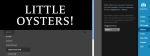
Experiment with mobile previews
If you’re using one of our 159 responsive themes, you might wonder how your readers experience your posts when they view them from their smartphones or tablets. Well, now you no longer need to guess. When you enter the Customizer (just hover over your site’s name in the top-left corner of the screen, and click on Customize), you’ll see these three symbols near the bottom of the page:

From left to right, these represent desktop view, tablet view, and smartphone view. Clicking between them will emulate the look of your content on different screens:
You can still play around with your settings in the different views. This allows you to try out new custom looks before implementing them, and to make sure your new header image, font, or site title (or any other elements you’ve tweaked) look great on screens of all sizes.
Let the best custom menu win
Virtually all our themes feature custom menus. These navigation tools make it easy for your visitors to find their way around your site with minimal clicks, so finding the right composition for your custom menu is crucial.
When you head to the Menus panel in the Customizer, you can try out the different ones you’ve already created to see which one works best, both visually and functionally. This is even more important if you’re testing your site’s appearance across devices, since menus are presented differently depending on the screen size. In the example below, we tested two different menus in the tablet view:

Depending on your priorities, you can decide which of your menus does the best job leading readers to the content they’re looking for.
Experiment with a new custom background
Adding a custom background image is one of the easiest ways to make your site your own (whether you’re looking for tips or for inspiration, we’ve got you covered).
When you go to the BG Image panel in the Customizer, you can upload and preview as many backgrounds as you wish, from a bold photo to a muted monochrome. Then, compare the different backgrounds to see which one complements your content the most. Here, for example, we’re testing the smartphone view of a sample page, using three different background images taken from Subtle Patterns, a free service:
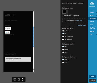

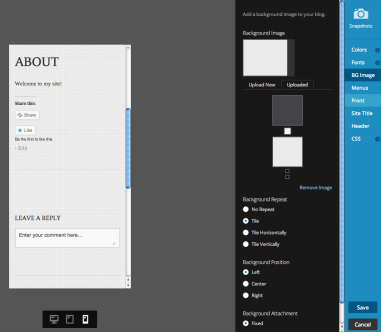
Trying out different colors and patterns will help you find a background image that keeps your content readable and helps you achieve the look you wanted for your site.
Are you interested in learning more about theme customization? You will find plenty of examples to inspire you in both our Customizing and Early Theme Adopters series.
- March 21, 2014
- Customization, Design, Features, Mobile
 WordPress.com News
Being able to see how my blog looks on different devices was great!!!
LikeLike
That’s awesome. It was not clear to me how to get to this feature. If anyone else is in the dark, before Ben wrote “When you enter the Customizer (just hover over your site’s name in the top-left corner of the screen, and click on Customize),” I would add “Log in to WordPress, click My Blogs and go the Dashboard of your blog.”
LikeLiked by 1 person
Oh, so the feature has been implemented.
I thought that only my theme was implementing it.
Anyways, great feature !
LikeLike
Looking forward for another upgrade on this site, especially for the mobile view
LikeLike