Twenty Fourteen, Unplugged
Love the key features of the Twenty Fourteen theme but prefer a more minimalist look? Take a look at how three bloggers reimagined — and stripped down — this popular new theme.
The Twenty Fourteen theme is barely three months old, but it’s already one of the most popular themes on WordPress.com — understandable, since its flexible, magazine-style layout gives you tons of leeway for presenting and highlighting different content.
What if you like what’s under Twenty Fourteen’s hood but want a sleeker look for your blog? No problem! As these three blogs prove, Twenty Fourteen is just as easy to pare down as it is to punch up.
Twenty Fourteen’s default layout takes full advantage of its adept way with featured images and content, and shows off multiple custom menu and widget areas:

But it can just as easily take on a clean, single-column look, as Callum Hackett chose:

Callum showcases his longer-form writing with a stark layout that makes his words the focus. He’s replaced the solid-color sidebar with his own image; the subtle colors give the blog visual interest without distracting from the posts. Widgets and menus are limited to a few key pieces to help readers find their way to other important content, like particular blog categories or Callum’s presence on Twitter.
Going minimal doesn’t have to mean skipping all of Twenty Fourteen’s great image display options. Blogger Torunn uses Twenty Fourteen for her sleek, paleo-focused food blog, paleomat (yes, it’s in Norwegian):

Her version of Twenty Fourteen adds a simple custom header (tagline translation: “only real food”) that’s a perfect complement for her mouthwatering photos. She takes advantage of both menu areas to make it easy for visitors to learn more about the blog or sort her archive of recipes, but sticks with one sans-serif font for her title, navigation, and content.
In the sidebar, she passes on colors and images in favor of basic white. Together, it creates a cohesive, serene feeling — her blog’s clean look echoes her focus on clean eating.
Fellow foodie Gabriella, who’s based in the UK, also went with Twenty Fourteen for her site Thyme & Honey. She adds a few more elements, but maintains a sleek look by keeping them monochromatic:
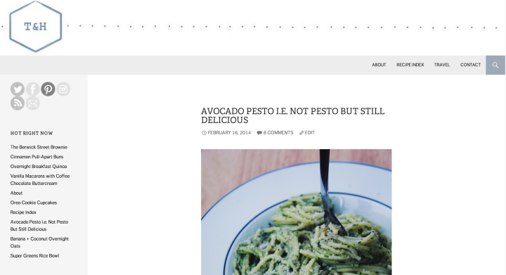
A pale gray sidebar and menu frame her posts and provide clear navigation. Her stripped-down, geometric header reinforces the minimalist look, while grayscale social networking icons add to the sidebar without taking away from the content.
These sites use the Custom Design upgrade to achieve their looks, but there are takeaways that anyone can apply, no upgrade needed:
- Keep widgets to a minimum, and streamline the information in the ones you do use.
- A simple white background always looks clean.
- Try a static home page or single-column layout rather than having multiple featured posts to maintain a sleek look.
If Twenty Fourteen’s features appeal to you, take a look at its description in the Theme Showcase or click around the demo site. Its bones may be the right foundation for your dream blog, even if you prefer simple to snazzy.
- February 24, 2014
- Customization, Themes

I recently added this theme for my blog. I love it even though I am learning something new about the theme every day. Glad I added this theme.
LikeLiked by 2 people
Thanks for this post- I love that theme!
LikeLike
I was never checked this Twenty Fourteen theme before.. After I read this post and I got to see the preview and well yeah I like this theme! Thanks for sharing 🙂
LikeLike
The reason, I use this theme is the simplicity. It offers a very nice layout for pictures and at the same time supports more text-based posts, too. Really, one of the best free themes, you (as in WordPress) can give us. And even without too much graphic identity, there are nice elements to customize. Thank you very much, from a long-time-blogger, restarting this nice little game of posting, writing and publishing 🙂
LikeLiked by 2 people
I looked at all these blogs before deciding to comment. Do you like food blogs Michelle? 😀
Then I tried it on mine. Uf.
Graphic design is very difficult. Setting things left often jars for people, and 2014 is basically a set left design. Magazine style is also very disruptive visually.
Totally agree with your three bullet points which I would always recommend.
I appreciate you need to bring out new designs all the time, but for me, 2010/2011 are perfect. I love the clean appearance, custom headers, and simple layout.
It’s easy to go for busy layouts but it can be off-putting. For me as a reader, I really prefer a very simple layout. The only blog I have with a picture background uses Quintus with a tiled layout of dog pix – because people who read dog blogs really want to look at dog pix 😀
Otherwise I love 2011, easy to make individual without paying for an upgrade and easy to read. I’ll be hard pushed to move from it.
Have you changed the way you can preview new themes? I thought we could trial them on our own blogs without activating but this time for 2014, I had to activate and then move back. Plus it was harder to then find 2011. There were no categories for blog themes. Or am I just being totally stupid today ? (Don’t answer that one).
LikeLiked by 1 person
@roughseasinthemed, you can preview themes from your dashboard (Appearance >> Themes) — hover over any theme, and “Activate/Purchase” and “Preview” options will appear.
(And yes, I might have written a food blog for five years.)
LikeLike
It was obviously clicking on the links from the post that was different. Or I was stupid as said above. I’ll have another looky and see if it has changed on there or is still as easy as before.
Food blogs are not me. I do write recipes (I have some recipe pages) and include the odd food shot – but per se, no.
However, you may or may not, find this amusing.
http://wp.me/p1XwsS-Zx
LikeLike
You know, I had looked at the Twenty – themes when I was setting up my ScribingEnglish blog. But I was afraid it looked too busy for what I was trying to portray, which was that of a returning and focused student. But I like the single column. Thank you for giving examples for the different ways it can be used!
LikeLike
I really appreciate these articles featuring inventive ways that bloggers make themes their own. Thanks for sharing these ideas. For now, I’m using Manifest, probably the simplest of all themes for my personal, ‘journal’ blog and I’ve gone back to using TwentyThirteen for my poetry blog (I trialled Syntax for a while but had some niggles with it). One theme I’ve seen featured quite a few times in ‘Recommended Blogs’ is Misty Look which has now been withdrawn (this seems a shame). One excellent feature of Twenty Fourteen is the option to put a menu on the left – there is something about this simple change in focus which really makes a blog look smart and interesting. Lots of food for thought (in many ways!) in this Hot off the Press post!
LikeLike
I sampled this theme a few weeks ago, but want to use a custom header. It only showed the title of my blog in small print above the left column. I love this theme, but want to make my title more prominent. Is it possible to enlarge it?
LikeLiked by 1 person
@susielindau, you can use a header, as the two food blogs in the post show. If you have Custom Design, you can use CSS to change/enlarge the header area to accommodate a larger image.
LikeLiked by 1 person
Cool! I just love this theme and my photos will be larger and set off by the black column. I’ll have to play with it. Thanks Michelle!
LikeLiked by 1 person
I LOVE this theme. It took me less than a few hours to format the perfect lifestyle blogazine which is somewhat different from the requirements of other types of lifestyle blogs. Twenty Fourteen gave me that perfect balance between minimalist and showstopper that I was looking for to introduce Live Well Be Fabulous to the world. The feedback I’ve been receiving from other Pressers tells me that I hit the target I was aiming for. Thanks for creating this theme! A+++ 🙂
LikeLiked by 1 person
This looks like a great theme. I’ve had mine for just over a year now, so thinking about changing it, might go for this one maybe. Great to learn more about it.
LikeLike
Still trying to figure out how to add the welcome section to the right sidebar on this theme. Could you offer some insight??
LikeLike
Twenty Fourteen has two sidebars areas — the left sidebar, and the content sidebar. To create a welcome section like paleomat, add a text widget to the content sidebar, and type your welcome message there. Also, be sure you’re not using the full-width page template; that one has no right sidebar.
LikeLiked by 1 person
Thanks so much for the explanation! Will try it now
LikeLike
Hi guys, how to expand the post width like the Callum Hackett site?
LikeLike
There is a full-width page template available (http://twentyfourteendemo.wordpress.com/default-page-templates/full-width-page-template/), and Callum uses CSS to widen the post width even more.
LikeLike
Thank you, Michelle!
LikeLike
Could you please show me how to increase the post width by CSS? I’m new to CSS. I’ve tried adjust the “Content Width” box but no changes. Thank you!
LikeLike
The Content Width setting is used to set the width for media inside the main content area, and it should be used in conjunction with custom CSS used to change widths. To expand the main content area and make it 200px larger, add the following to your Appearance > Customize > CSS editor:
.site-content .entry-header,

.site-content .entry-content,

.site-content .entry-summary,

.site-content .entry-meta,

.page-content,

.post-navigation,

.image-navigation,

.archive-header,

.page-header,

.contributor-info,

.comments-area {

	max-width: 674px;

}
LikeLike
It works, fantastic! Thank you very much, Sheri 😀
LikeLike
I have been using this theme since it became available and I love it. I have seen some great customizations in my bloggy travels. I’ve noticed a few users have a great social media widget — it presents icons for all of the major social media networks. Some have a nice rollover feature. I cannot find a widget like this on the dashboard.
I am curious as to where to find this element so that I can add it to my own blog. Thanks!
LikeLike
Some themes, like Ryu and Profile, offer social media icons as a theme option — you’d find it in the Customizer or under Appearance –> Theme Options. In other cases, like n Thyme & Honey, the blogger simply uses a text widget and puts in the images and links herself.
LikeLike
Thank you 🙂
LikeLike
thank you so much for the information! i’m loitering in the retired Titan while I decide how to move forward, plus have a new site to build out. Do you think it’s important to have Custom Design for success with twenty fourteen? And you think it’s social media friendly? Are you familiar with Thesis? thanks!
LikeLike
Custom Design is a nice-add on, but all our themes are created to look (and work) great without it, including Twenty Fourteen. Social media-wise, I really like how Thyme & Honey approached it, with the collection of clean, similar-sized icons — something anyone can do with a simple text widget.
LikeLike
I really like the 2014 theme…BUT I don’t understand why the left column keeps shifting to the end and doesn’t stay on the left where I set it up… sometimes it’s there and then most of the time it is at the very bottom of the blog. can it be fixed to stay put? Sue
womenlivinglifeafter50.com
LikeLike
@Sue, the sidebar should stay where you put it! If you’re having challenges, I’d suggest contacting support or searching/starting a thread in the support forums.
LikeLike
I am experimenting with Twenty Fourteen for a City website.
On my desktop I can see all the Menu items across the top. When I look at the tablet view it shows all the Menu items.
However, when I go to the site on my iPad it does not display any of the menu items just the little 3-bar icon which is not an intuitive place to touch/click for most people. It certainly was not for me.
How can this be fixed?
Thanks!
LikeLike
@Steve, Twenty Fourteen is a responsive theme, which means it shifts itself to accommodate smaller screens by doing things like collapsing menus. If you’d like, you can turn off your mobile theme in Appearances –> Mobile. You can also use custom CSS that applies specifically to your mobile theme to mane changes — just use “.mobile-theme” at the start of your CSS selectors to target the mobile theme.
If it helps, the three-bar icon is increasingly becoming the norm for navigation on mobile-friendly sites.
LikeLike
I’m trying to SEO my Twenty Fourteen page. My current problem is with h1 headers. I have three of those (site-title, menu-toggle, entry-title), but I only should have one. Is there a way to fix this?
LikeLike
I would recommend checking out this article: http://webdesign.tutsplus.com/articles/the-truth-about-multiple-h1-tags-in-the-html5-era–webdesign-16824
LikeLiked by 1 person
Twenty Fourteen Theme rocks out on WordPress.com… nice color, meuning options. Haven’t yet had a chance to rework it under the hood with the full WordPress.
LikeLike