One Theme, Two Ways: Customizing Twenty Fourteen
In the two months since its release, Twenty Fourteen has already made quite a splash, becoming the theme of choice for almost 200,000 sites. If you’re a new blogger (hello, Zero to Hero participants!), it likely looks familiar. It’s our default theme for 2014, so it was the one that greeted you when you first landed on your homepage.
Twenty Fourteen has a flashy magazine layout that enables you to showcase content in numerous visually striking ways. With plenty of free customization options right of the box, including new color palettes, this is a theme that can give any site a major design boost.
If you’re looking for ideas on how to customize Twenty Fourteen to make your content shine, look no further than the two sites featured here today: they have each taken the theme in a strikingly different direction.
The Daily Slice
What do you know — a magazine theme used by an actual magazine! The Daily Slice, a collaborative online music zine, makes the most out of Twenty Fourteen‘s versatile layout, creating a cool look that’s at once vibrant and streamlined.
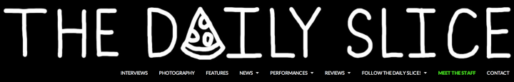
With a black-and-white custom header image that works perfectly with the theme’s default color scheme, the site channels an underground vibe from the get-go. The site’s main menu blends seamlessly into the header for easy navigation.

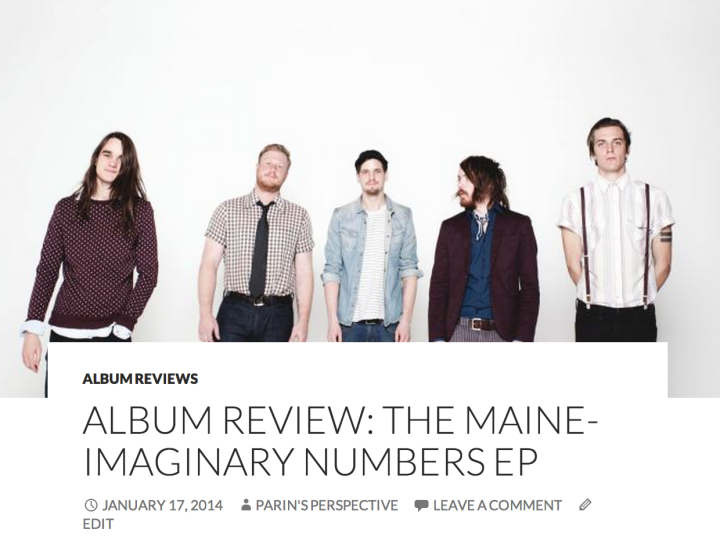
The site then capitalizes on Twenty Fourteen‘s featured content area, highlighting three recent posts, all with generously-sized featured images (the theme lets you select up to six posts to showcase).

Since this is a group effort, the magazine’s authors are all given a moment in the spotlight. Sidebar links direct visitors to each writer’s author page, and a sleek Author Grid Widget contains red-white-and-black illustrations of the writing staff.
Twenty Fourteen also comes with a contributors page template, a unique way to give credit to everyone involved in a group blog, and The Daily Slice features a particularly creative one.
One of the most notable visual elements of this theme is the ability to use splashy featured images on the homepage as well as on single-post pages. Whether your visitors arrive at your site through a search engine, a shared link, or the WordPress.com Reader, they’re in for a visual treat.
edjelley.com
A blog dedicated to the retro beauty of fountain pens, edjelley.com presents a bright, clean take on Twenty Fourteen. The blogger’s intentions are unmistakable no matter where you look on the page: this is a place to enjoy the colors and shapes of lovingly-crafted objects.
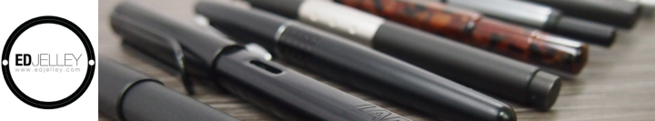
An elegant custom header image — complete with a sleek logo — announces the site’s theme. Then, Ed, the pen aficionado behind the site, uses Twenty Fourteen‘s featured content slider to give his photos maximum visibility.


Other small touches make the site both visually coherent and smooth to navigate. An Instagram Widget in the right sidebar adds a dash of color and presents more stationary-related eye candy.
Across the page, on the right sidebar, enticing Text Widgets invite readers to follow Ed on other social networks and encourage them to submit content to the site — a smart way to foster interaction.
Even the primary menu serves several purposes. In the midst of the site’s colorful images, its neutral shade acts as a soothing visual element. It lets users find the content they look for, but also includes links to Ed’s Pens for Sale page as well as to his blogroll page — a great space saver, freeing up valuable real estate in the sidebar.

The beautiful design of edjelley.com stays intact no matter what device you’re using. As a fully responsive theme, Twenty Fourteen guarantees your visitors see your site the way you intended it — whether it’s from a computer, a tablet, or a smartphone.

edjelley.com viewed on an iPad
New color palettes
In case you’ve considered Twenty Fourteen but prefer a brighter color scheme than the sleek black that comes as its default background color, we have good news.
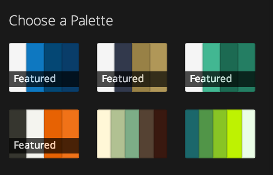
We’re happy to announce that the theme now arrives with four free featured color palettes. Just go to the Colors panel in your Customizer (in your dashboard, head to Appearance → Customize) and pick the one that suits your mood.
Are you curious to see more customizations of Twenty Fourteen? Here are a few more creative takes:
- Honey & Thyme, a food blog with a clean, modern look.
- Coyopoa :: lightning in the blood, a writer’s stark, black-and-white homepage.
- A Pretty Penny, a soft-hued design and DIY blog.
For more customization tips and previous installments of our Customizing series, click here.
- January 20, 2014
- Customization, Design, Themes

This is a magnificent theme. Congratulations to its creators! My only little complaint is that like and share buttons don’t show in this theme on the home page and you must click and open the particular post to see these buttons. This doesn’t suit my purpose, otherwise Twenty Fourteen would be my hero and my first choice.
LikeLiked by 1 person
I am currently using Expound theme which I find to be the most appropriate magazine-style theme for my blog.
The availability of free color customization for twenty-fourteen is a welcome sign, and I would very much contemplate on applying this theme to my blog. However, the Featured Image application on this theme is totally different from the Featured Image application on Expound. As an example, the Featured Images on twenty-fourteen have been duplicated under each post, where as, the same is not the case with Expound. Hence, for this reason, I am unable to even contemplate making a change.
You should consider having a consistent policy of your Featured Image application across the board.
LikeLiked by 2 people
Thanks for your feedback! As you’re right to point out, featured images function differently across themes, as each theme’s featured content area has its own design. Ultimately, it’s really all about each user finding the right theme for his/her needs — I’m glad to hear you’re enjoying Expound, another great theme.
LikeLike
Love this one. Time for me to play around with new theme templates again!
LikeLike
I really enjoy the tips and ideas you so kindly share! Thank you! 🙂
LikeLike
Thanks for all the kind words!
I’m loving Twenty Fourteen so far, it’s my favorite theme I’ve used.
Adding the custom upgrade really expanded what I could do with the site visually, and I’m super happy with how it’s turned out.
LikeLike
Great to hear — the site does looks wonderful!
LikeLike
Wow, this theme look brilliant!
LikeLike
Wow, I really need to take a look at those customisation options. I am new, and picked the 2014 theme as it looked amazing. I just didn’t realise how diverse it could be!
LikeLiked by 1 person
What a great idea. Look so cool
LikeLike
This post is awesome……How to use our own theme in wordpress……
LikeLike
I’m enjoying the theme, but noticed within the e-mail sent today that I had the option to select a few color palettes. Unfortunately, I am not seeing them listed. Is there anything that I would need to do on my end?
LikeLike
They are available for you to choose from without you needing to do anything other than choosing the one you want (if you do want to use one).
As the post suggests, just go to the ‘Colors’ panel in the customizer, and you’ll see those four palettes with “featured” written on them — those are the free palettes!
LikeLike
The 2014 theme is truly elegant !
But couldn’t modify the Font, style and size, even after repeated attempts
Fantastic job, nevertheless 🙂
LikeLike
You can preview Custom Fonts by going to your Customizer and clicking on the Fonts panel. To activate these fonts, though, you’d need to purchase the Custom Design upgrade, which also includes Custom Colors and Custom CSS.
LikeLike
Can someone give me some ideas to what themes, or just some help. How would I go about posting things like poetry here. But I do like your theme ideas.
LikeLike
Pretty much any personal blogging theme could be a good fit for poetry — it really depends on your own tastes and the mood you aim to create for your writing. For example, you could try one of our minimalist, journal-like themes. You can also find some helpful resources on this page on formatting your posts to accommodate poetry’s (sometimes unusual) page layout.
LikeLiked by 1 person
Unfortunately, there seems to be a new bug in WordPress as when I click on the Appearance option, it shows the themes for a few seconds before switching back to the Dashboard.
LikeLiked by 1 person
There appears to be a bug at the moment in IE9, and our developers are looking into it. Please try a different browser in the meantime, thanks!
LikeLike
I really like this theme and I’m looking forward to customizing it.
LikeLike
Loving this new theme. How do you get the 3 posts/photographs to display across the top of the front page? And place twitter, facebook, pintarest icons in the sidebar? Does this require a custom upgrade? Thanks!
LikeLike
To populate the featured content area, first tag the posts you’d like to see there with a designated tag of your choice (for example, “featured,” “front page,” or anything else that makes sense to you and that you don’t use for any other purpose). Then, you’ll need to go to the Customizer and click on the Featured Content panel. Choose “Grid” in the layout menu, and enter whatever tag you settled on for your posts into the “Tag name” box. The theme will automatically pull the posts with that tag and place them in the featured content area. Note: you can only have up to six posts in that area in Twenty Fourteen.
As for the sidebar icons, the easiest way to achieve this is via Image Widgets. Upload the image files of the icons you want — either ones you design yourself or those readily available online — to your media library, and then use their URLs in the widget’s “Image URL” line. Finally, insert the URL of the destination site — wherever you want readers to go to when they click on the image (for example, your Facebook fan page) — into the widget’s “Link Url” line.
LikeLike
I had no idea that 2014 could be made to look so eye pleasing. Thanks for sharing 🙂
LikeLike
Great theme, I love it but as a beginner, I cannot figure out how to use a flexible header. It always force me to crop and then I get a white bar on the left. Can anymone help? I don’t plan to pay for he advanced design considering I can not work in css.
LikeLike
For the header image to show well, choose an image that’s at least 1260 by 240, which is the size of the header. Just to clarify, custom header images are always free — you certainly don’t have to pay for any upgrade to be able to use them.
LikeLike
I knew 2014 was something special first time I saw it, and I keep coming back to admire it. As shown by the blogs you’ve highlighted here, 2014 has a look that’s as contemporary as tomorrow. Really crisp, clean typography, and it’s more readable than many avant guard typefaces.
It’s so good and so versatile that it sort of intimidates me. For a next step, I think I might switch to Expound. Eventually, I’ll get up the nerve to give 2014 a spin.
LikeLike
This is a magnificent theme. Congratulations to its creators!
LikeLike
Thanks to this post, I gave this theme a second try and love it.
LikeLike
Question: What is the recommended size for one of the 6 featured images across the top of the theme? If you know, please reply as soon as possible x)
LikeLike
The theme will convert the image size to fit it into the featured content area. As for featured images themselves, we recommend using images that are at least 1038 pixels wide.
LikeLike
Thanks for the reply, and also; does the slider slide automatically, or do you have to click the “next slide” button manually?
LikeLike
In Twenty Fourteen, the slider uses arrow buttons to move between featured posts.
LikeLike