Improved Theme Preview, Widgets Management, and a Responsive Dashboard
We’ve launched a number of updates, from visual enhancements to handy admin tools, to improve your overall WordPress.com experience. Here’s a rundown of what’s new:
- Improved theme preview: A sleeker preview and selection process for themes.
- Add widgets with one click: An updated panel makes widget management a snap.
- Refreshed dashboard: A cleaned-up and responsive dashboard area.
- A more modern look: Introduced over the past several months, your under-the-hood look is simpler and more modern, and served up in eight color schemes.
Improved theme preview
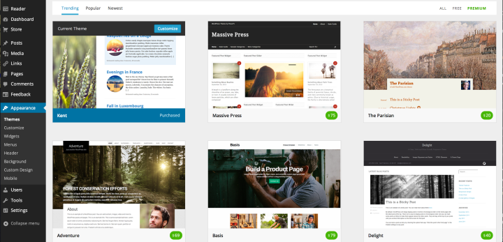
A more visual experience: sleeker display and bigger theme screenshots.
In Appearance → Themes, you’ll find an enhanced theme preview and selection process — and a much more visual experience:
- A sleek, fast-loading display of available themes to try out and activate.
- Bigger and bolder theme screenshots, showing more of each theme’s details.
- Options to customize your current theme (displayed at the top left) and preview and activate other themes.
- Ability to click on a theme for a description and summary of features and quickly flip through theme description pages with navigation (left and right arrow) keys.
Add widgets with one click
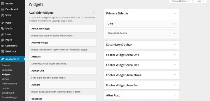
The updated widgets screen makes it even easier to select and manage your widgets.

Select a widget, then add it to your blog with one click.
In Appearance → Widgets, you’ll find nifty changes that make it easier to manage your widgets. We streamlined the widgets screen, which now emphasizes your sidebars/widget areas and activated widgets.
Now, you can select an available widget and choose which area of your blog you want it to appear — with just one click. The menu options that appear will depend on your current theme, so your widgets screen might look different from the examples above and on the left.
This click-to-add tool is especially handy if you’re on a touch or mobile device — or use a theme with multiple widget areas. And if you prefer, you can still use the drag-and-drop method to activate widgets, too.
Refreshed dashboard

A cleaned-up dashboard screen (with a pop of color from the Midnight scheme).
We’ve streamlined your dashboard screen and consolidated some features. Click on Dashboard and you’ll see changes, including:
- “Right Now,” which displayed a summary and total numbers for your blog, is now “Site Content,” and is simplified and easier to read.
- “Recent Comments” has been merged into a new “Activity” box, which now shows your last five published posts and any scheduled posts.
- “QuickPress” is now “Quick Draft,” and we’ve also added a box for “Recent Drafts.”
- The dashboard screen is now responsive, showing the appropriate number of columns based on your screen resolution. So, we’ve removed the “Number of Columns” option under Screen Options.
A more modern look
Over the summer, we introduced a redesigned dashboard, featuring better contrast and the lovely and modern Open Sans, a free, open source typeface. We’ve made numerous tweaks to improve your behind-the-scenes experience, from redrawing the icons to making the design responsive and tailored for desktop computers, touch devices, and smartphones.
Last month, we also added options to personalize your dashboard with a splash of color: eight different palettes, including the classic default scheme. You’ll also find a light-grey one, which we designed for our users who are sensitive to light. If you haven’t already, pick your favorite in Users → Personal Settings.
Got a self-hosted WordPress site?
For our self-hosted friends running WordPress.org, these changes will be available soon with the 3.8 release.
We’re constantly tinkering behind the scenes and making updates to make your dashboard experience the best it can be. If you have feedback or questions, chime in on the Forums. For support questions, contact Support.
- December 2, 2013
- Dashboard, Design, New Features, WordPress.com

While it looks nice, I wish it worked properly. Right now as a result of this change, one can’t tag comments, or see the statistics’ charts, or hover-open side-bars in the Dashboard.
Well, I guess once all the kinks will be sorted out, it’ll be an improvement! I did also notice you guys raised the “Store” higher, or is it just my memory playing tricks on me?
LikeLike
I think the Store tab is in the same place it was since the last refresh of the admin panel…
LikeLike
You can drag/drop boxes within the screen — if you want the stats panel to be more accessible, you can drag it up top if you want.
LikeLike
A little while ago the theme preview stuff did not seem to work at all
The Widget change is welcome and looks good, but in some cases a new Widget will now be a two step process, click and send to the correct general area, then drag to the right place inside the sidebar – but no more drag from the bottom of the Widget list and the long scroll up the page
thanks for not getting rid of the drag & drop
LikeLike
How do I get the related posts icons and thumbnails to show up at the end of each post? Are their only certain blog templates that allow this?
LikeLike
You can read more info on Related Posts in our previous announcement. I believe the feature works on all themes hosted by WordPress.com, but it’s turned it off for a couple themes that includes related content as part of the theme (to avoid showing two separate related content sections per post).
You can activate by going to Settings > Reading under “Related Posts.” There are some limits: posts must have 500 bytes of content (about 100 English words) and you need to have at least 10 published posts.
LikeLike
I like the font, the color choices … but suddenly, my dashboard is columnar with two or three blank columns, so all my real information is squeezed into the leftmost narrow column. That seems weird and wrong … Glitch or feature?
LikeLike
AHA! Got it! Looks normal again. I do quite like the new color schemes. And the snow is falling. Jingle jingle!
LikeLike
Overall, nice…though I miss the “Recent Drafts” section.
LikeLike
Your drafts are in the Quick Draft box — see posts under “Drafts.”
LikeLike
Please bring back the Number of Columns option. I hate the two-column look. I used to get all the info at a glance before now I can’t 😦
LikeLike
What information do you want to see first/all the time?
LikeLike
Stats, Activity and What’s Hot.
LikeLike
If you click on the Screen Options tab on the top right, you can keep Stats, Activity, and What’s hot check-marked and unclick the others — you’ll then see the boxes you want to see all the time. Alternatively, you can keep ’em all checked, and just drag/drop the stuff you want to the top of the screen.
We’re always working behind the scenes to make improvements — thanks for leaving your feedback.
LikeLike
Like I said, this is the info I wanted at first glance not that I didn’t want other options. It’s taking too much space and pretty much giving me the same information. I love WordPress and this is a minor glitch but I would love to have that option back or atleast a way to resize the boxes.
And you guys rock!
LikeLike
Cheri, to your second comment, for a while things wouldn’t load. Guess the new UI was propagating.
Anyway, suggestion – add the ability to control the number of columns on the dashboard main page. I don’t want 3, I want 2, and to increase the size of the text/boxes within them. Well, it’s a minor quibble, consider it in the future 🙂
LikeLike
The one-click widget is a great behind the scenes improvement. I heartily dislike dragging widgets way up to the top of the screen like a bag of itchy kittens.
And the colour schemes for the back end – totally unnecessary and very, very nice. 🙂
Well done WP people.
LikeLike
Many Thanks Cheri Lucas Rowlands! 🙂
LikeLike
First two changes are cool…not sure how the Dashboard is more responsive or streamlined for a user now though.
Comments were better all by themselves & adding activity that isn’t wanted didn’t streamline our dashboard – it made it a little cluttered.
Was seeing published posts a highly requested feature?
Would prefer to see scheduled posts and/or more drafts rather than seeing what was already published.
While checking things out – hit the “See 3 More” link and now see 5 published posts that we don’t want to see and can’t change it back to just two. Would love to be able to select the number to be seen including zero or to remove it while leaving comments. At a minimum how can we get back to just seeing 2?
Two other items on our wish list:
1. Would really like to be able to search posts from the main admin (or any admin) page without having to go to the Posts page or homepage
2. Would also like to see “Scheduled” when hovering over the Posts icon on left to streamline getting to scheduled posts
Random thoughts…keep up the great work!!
LikeLike
I now see 3 columns on my desktop — but the right-most column is completely blank. What’s up with that? How can I eliminate the blank column? Or add something to it? Or do SOMETHING?!
LikeLike
The dashboard screen is now responsive, which means the layout changes depending on how big/small your screen. (If on a computer/laptop, try adjusting the browser screen to see what I mean.) This makes it easier to read the screen on various devices. You can drag/drop the boxes within your dashboard, so you can drag a box to the top of the empty right column, for example.
LikeLike
I know WordPress is expanding and you guys have really made it far since 2005 but can you please increase free themes. Many of us for reasons private or public cannot buy many of the themes. Yes, I love the new dashboard interface. One question Ms. Rowlands can you see if the reader gets tweaking as well? Also as this has become the hashtag generation please make that more prominent here. Also I have been here since like “dino” period lol and must say that can’t we make some customizations free because it would be nice. Please make the content publishing page more malleable; you have already done so much to it but at times it feels rigid. Oh yes, on a final note please do another longform post as I loved them. They were so interesting 😀 Thank you Ms. Rowlands for the nice update.
LikeLike
We launch themes every week, usually on Thursdays. We’ll continue to launch both free and paid themes, and you can always search for the free themes in our showcase. You DON’T need a premium theme to customize your blog/website — our Customizing series shows just what you can do with simply uploading a custom header and background (for free) — we’ll continue to do those.
You can customize with Image Widgets, too — great ways to “brand” your site the way you want to (again, for free).
The Reader is constantly evolving — nothing noted here in this post, but you can see a discussion thread of recent updates in the forums. Hope this helps.
Thanks for your other feedback.
LikeLike
There doesn’t seem to be a way to access the full comment now, without going to the All link. Clicking the title link takes you to the Edit Post page.
Previously you could go to the comment and read it, and wasn’t it possible to click the Commenters name to see all their comments?
Now you can’t do any of that.
LikeLike
Not a fan of the dashboard layout changes, I’m afraid.
Really not crazy about the “quick draft” box (which I NEVER use) stuck up on top of my list of recent drafts, which I use frequently.
I also dislike the consolidation of recent&scheduled posts with recent comments. These things are not at all the same as each other: one is an author activity, the other is a discussion activity. I can see where the author activity makes sense for group blogs, but on my solo blogs it’s quite annoying that it takes up space before the recent comments, which I *am* interested in.
The columnar view of “top posts” next to “top searches” is bad: the post names get cut off. I’d rather have them on separate tabs.
Both here and in “recent drafts”, I’d rather have a slidebar than a button that will take me away from the dashboard in order to “view all”.
Should I be able to rearrange those sections on the page? I’d like to pull some items over to the right hand column, but it won’t take.
LikeLike
Thanks for your feedback.
Yes. If you’re unable to drag a box and make it “stick” successfully, it could be because your screen isn’t wide/big enough. For example, if you’re on a computer and widen your browser page, try again — you can drag and drop (and you might see another column appear). It’s a responsive layout, which means the screen can change based on the device you’re on.
LikeLike
Widget management is a revolutionary change you’ve brought to wordpress.com.
LikeLike
The new dashboard was a fabulous surprise to wake up to this morning. Thanks WordPress!
LikeLike
Using many of these and I am impressed !!!
LikeLike
Cant wait for the new release. Adding widgets with a single click will definitely be better than dragging them around! Also the refreshed dashboard looks awesome. Cant wait to test it soon!
LikeLike
I hope I’m not the only one who is unhappy that the edit window is gone from dashboard, requiring a secondary click on the Posts, New Post sidebar to pull it up. I also preferred the longer list of drafts that displayed in the previous dashboard.
LikeLike
You work so hard on new features. This is why I still stay on wordpress.com. But I have one idea…. have you ever thought about creating a feature that allows quiz questions within a post? This would be a lot of fun. 🙂
LikeLike
You can achieve something a bit similar using polls, which you can add to a post or page.
LikeLike
This could explain then why I’ve been having so much trouble posting items and reading others. I got pretty tired of being reset every single time. Let’s hope everything runs smoothly now.
LikeLike
Hmm, The trouble with a ‘responsive’ dashboard is the assumption that we’re always using the same sized screen. My desktop is twice the width of my laptop and I use both interchangeably, often on the same day. So if I move sections into the blank boxes on my desktop, what’s going to happen when I open up my laptop? The desktop will respond to that, and I’ll have to shift everything around again. This could get to be really annoying.
The only innovation I want is to be able to get rid of What’s Hot.
LikeLike
so how do you use it. Any video. Am a new user. By the way, what is widgets? thank you. How can i use it on my blog? how can i create a homepage on wordpress. thank you for the details
LikeLike
Hi there — you’ve asked a number of questions unrelated to the features of this post; I’ll do my best to help direct you and offer starting points for your searches:
You can embed videos from the web: https://wordpress.com/support/videos/ But if you want to upload your own, you need the VideoPress upgrade: https://wordpress.com/support/videopress/
Widgets are tools you can use to add features/embed things on your site. We have a number of posts about them and how to make the most of them:
https://wordpress.com/support/widgets/
https://wordpress.com/dailypost/tag/widgets/
https://wordpress.com/blog/?s=widgets&x=-1047&y=-1838
Here’s info on creating a homepage/front page on WordPress.com: https://wordpress.com/support/pages/front-page/
LikeLike
I am now finding it difficult to locate notifications in order to approve and post comments.
LikeLike
Not sure how you previously/normally locate your notifications and comments, but if you used the dashboard screen, you can look for the “Activity” box (scroll down the page to locate it if needed) and then drag it to the top somewhere. But we also offer different ways to see notifications — you can also access notifications in the top right of your admin panel. Look for the ever-changing icon in between “New Post” and your name — click on/hover over that and you’ll see your notifications, recent comments, etc. You can click “View Archive” to see them all.
LikeLike
Thanks; I have figured it out…
LikeLike
Thanks for your work! It’s really cool!
LikeLike
Thanks for whatever it is you did. Things are easier, BUT, I can no longer access my dashboard menu. It’s just no longer there. What’s up with that?
LikeLike
Are you still having issues? You can always access your dashboard screen and entire admin panel here: https://jemimahsummers.wordpress.com/wp-admin/
LikeLike
Cheri – Thanks! I didn’t have a “draft” in the queue when I wrote my comment. I see it how! Thanks!
LikeLike
Where i can find the filter option at the new theme preview look ? (i’m using it, for example, to find rtl theme and etc)
LikeLike
You can use the search field at the top of that theme preview screen to filter the results — since it searches the theme description pages themselves, it’s best to use the terms on those pages (ie, “post slider,” “custom header,” etc.). Looks like if you type in rtl (no quotation marks), it pulls up various themes tagged with “Rtl language support.”
LikeLike
Thank you very much Cheri ! it is work with rtl. but what if i like to get themes that are rtl and responsive designed ? i tried “rtl, responsive design” at the search box and got 0 results.
LikeLike
Right — that’s probably too specific of a search. (Although you can at least find responsive themes by searching either “responsive width” or just “responsive.)
It’s a new feature and we’ll refine over time.
LikeLike
The old filter enabled me to find very easily those themes that i’m usually looking for (rtl + responsive design). i hope you will find some solution for this kind of needs.
LikeLike
I do not like the new dashboard. I am adaptable to a lot of things, you have to be in the computer world. Things are always getting fixed that are not broken. I liked my two columns. This morning I have three columns with an empty box in the third. I have to search for my comments to approve and not approve. Ok I found them, computer is a world of getting used to things, but I do not like this three column thing in my dashboard and spent most of today searching for the box to tick to remove the third column. I assume I am right in noticing that this option no longer exists. Oh dear, what a shame.
LikeLike
Surprise, surprise – thanks for the nice surprises 🙂
LikeLike
I just have one question, can we still upload themes that we have downloaded from websites such as Wootique?
LikeLike
Hi there — this post is about features for users using free sites and blogs hosted on WordPress.com; you can’t upload your own themes on WordPress.com. You might be referring to your self-hosted WordPress site.
That said, these features will be available soon for folks with self-hosted sites (in the 3.8 software release).
LikeLike
Yes, sorry, that is exactly what I meant! Thanks 🙂
LikeLike
I write my posts ahead of time and schedule them… I used to be able to go through and check my scheduled posts in case I wanted to edit prior to publishing… I cannot find where I can get to SCHEDULED POSTS… I see drafts… but not the scheduled posts, please help!
LikeLike
On the dashboard screen, your scheduled posts are under “Publishing Soon” in the “Activity” box: https://cloudup.com/cIb0smG1oSz
(You can scroll down the screen if you don’t see this at the top, and you can drag-and-drop the box to the top if you prefer and if you use this box often.)
If you click on a post link, it will take you to the edit page.
LikeLike
Really wish that drafts section was back up front – so much faster when working off and on. Better than having the recently published posts listed right there.
LikeLike
and yet – you are just great with your great efforts to keep improve it for us . many thanks for that !!
LikeLike
Much better than before. ;-D
LikeLike
LikeLike
Not being able to read the full comment or click the link to the full comment from the dashboard is not an improvement.
LikeLike
Having same problem as many others – 2 blank boxes in the dashboard just reduces the stats size, etc – would much prefer to have option for 2-column. Hopefully the option to change comes back. Spent 1 hour finding out this wasn’t a virus problem, then there was supposed to be an option to select number of columns (which was missing), them finally this post explaining that is an improvement. Responsive might be a better term for letting the user decide…
LikeLike
Always improving, always seeking to improve – great stuff, WordPress.
LikeLike
Nice look really. This is a face lift. You can ask anybody you know to come fly with the team.
LikeLike