Refine Your Blog’s Voice with New Fonts
Using the perfect font gives your blog personality — and just might be the design element that inspires you to find your own voice. We’ve added a bunch of terrific new fonts for users of our Custom Design upgrade from our partners at Typekit.
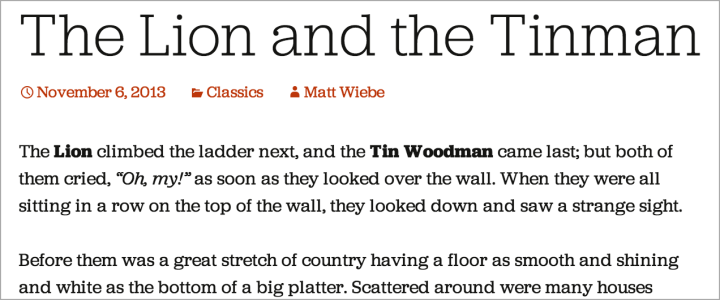
Infuse some retro-future attitude in your headlines with Brandon Grotesque Medium, or make your text effortlessly elegant with the incomparable Chapparal Pro:
Or, you might want to try the sophistication of LTC Bodoni 175 Italic paired with the pleasantly readable Open Sans—our most-requested font—for your body text.
Several of our new families have weights beyond the usual, letting you reach new heights of unified expressiveness. Jubilat Light for your headlines pairs perfectly with Jubilat Regular for your text:
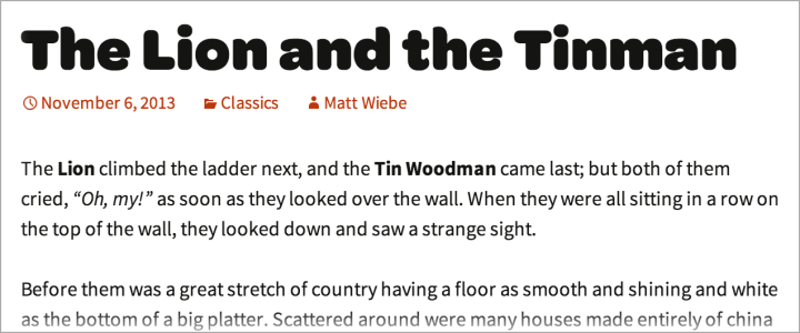
Or, you might go for something more modern and fun! Behold the rounded Omnes Pro Black in this bold headline, and Source Sans Pro performing admirably in the text:
As the saying goes, “In with the new; out with the old!” In order to make room for these beautiful new fonts, we’ve retired some of our older, less used fonts. If your currently chosen font didn’t make the cut, breathe easy: it will continue to work just fine.
The examples above show the expressiveness of just a few font pairings in a single theme. We’re really excited to see what you can do with the power of beautiful, well-crafted fonts—old and new—across over 200 beautiful themes.
- November 7, 2013
- Customization


oh God thanks! Can’t really find the one I am really into so far. Keep them coming! 😀
LikeLike
New fonts! O frabjous day! Callooh! Callay!
LikeLike
OMG, I already spend so much time testing out the various fonts, and now I’ll have more. I’m like a kid in a candy store! 🙂
LikeLike
Delighted to learn of new ones – can never have too many fonts. Yesyes, I know: they slow down one’s computer. But in the case of WordPress, they could only possibly slow you down, not me! [grin] Just joking …
LikeLike
Calluna is beautiful -the f and g are distinct, yet clear in regular as well as italic. Too bad it’s only for a month. Me thinks that the price per year is too much for a personal blog.
LikeLike
fabulous fonts! I look forward to using one! 😀
LikeLike
Fonts rule!
LikeLike
Finally! 🙂
LikeLike
I like the Chapparal one. Reminds me of Castaneda 😉
LikeLike
Chapparal is one of my favourites as well!
LikeLike
I do not use a custom upgrade, but a line of code:
The only problem is having to format it myself, finding where the line ends
LikeLike
Clare, adding inline
font-familystyles to HTML elements in your post editor will indeed work. 🙂 But, only to an extent. Your technique is only effective if your blog’s readers already have that font installed on their computer. Plus, it would make it really tedious to make a change in the future: you’d have to edit every post. Custom Fonts makes the font available to all your readers, and makes it really easy to change everything in the future with just a couple of clicks!LikeLike
What good are fonts and outstanding layout when the posts are shown in tacky pop-ups? Get rid of this “innovation” in Reader – it is in the way!
LikeLike
Thanks for sharing your thoughts! The Reader is one of our many ongoing projects to make both reading and writing great on WordPress.com on any device. Opening posts in the Reader does mean that readers won’t see your site’s fonts, but it’s also a great way for people to discover your blog in the first place, no matter the device they’re on.
You can also click on the time at the bottom of a post in the Reader to be taken to their site instead of the popup.
LikeLike
Thank you very much, Matt. I will use the “boottom-click” so I can see the sites in all their glory!
LikeLike
Those fonts are ridiculously bland and I don’t see anything abstract of different to any other standardized font. Not trying to be a critic but expected a bit more abstraction within reason.
LikeLike
How could I not want to use a font with “grotesque” in the name. It simply screams me.
LikeLike
This comes in really handy. Thanks.
LikeLike
Alright, yay, fonts! But you would not believe how much it bugs me that, yes, even though I know the point here isn’t the Lion and the Tinman, it truly bugs me that I can’t read the entire story. 🙂
It was a great example of fonts, though.
LikeLike
Fonts can be expressed as emotion when typing out your message. Including the right one can effectively set the mood for your audience to interpret your message.
LikeLike
This is great!
LikeLike
Fonts are great and I certainly have a tons of them on my dedicated drives, but I prefer using creative fonts in my graphics, not in my pieces. The inclusion of well-designed & relevant graphics go far beyond a simple matter of including fonts in posts. It’s not worth the upgrade.
LikeLike
Brandon Grotesque Light also has a good feel to it.
LikeLike
awesome!
LikeLike