The WordPress.com Dashboard Gets a Beautiful Makeover
Every day, you blog, you create, and you make things with your WordPress.com site. Meanwhile, behind the scenes, the code that runs WordPress.com gets updated dozens of times a day, as we deploy improvements. While you can’t see the vast majority of those changes, there is one improvement we can’t wait for you to see: a brand-new, redesigned WordPress.com dashboard featuring better contrast and the lovely Open Sans typeface.
The dashboard’s new design features Open Sans — the free, open source typeface by Steve Matteson offers a pleasing reading experience.
Back in April, I shared our goals for the WordPress.com dashboard redesign:
- It should have a simple, uncluttered design; free of excessive decoration and focused on your content.
- It should use webfonts for modern, legible typography that’s consistent in every browser.
- It should have a responsive design that’s tailored to desktop computers, tablets, and smartphones.
- It should do all this while retaining the familiar, user-tested dashboard interface that millions of users already understand.
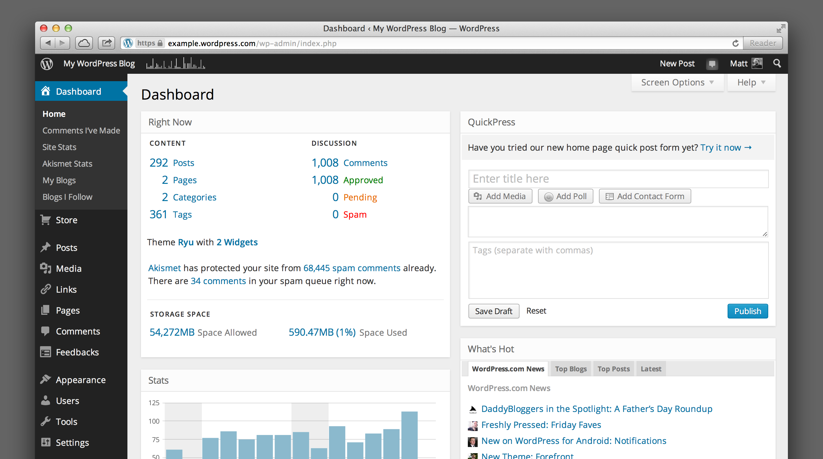
We’ve redrawn all the icons, opened up spacing, moved to Open Sans as our default typeface, and increased contrast to make the dashboard as beautiful on the inside as your blog is on the outside:
Simplified new icons and stronger contrast are two elements of the dashboard’s redesign.
Opt in to responsive goodness
We’re also hard at work on a responsive design, so you can view and work in your WordPress.com dashboard on your smartphone or tablet. It will be available for everyone later this year, but you can preview it today. To enable the responsive dashboard, go to Users → Personal Settings and click the checkbox next to: Enable experimental responsive design (MP6). If you’ve previously opted in to our design preview, you’ll have this enabled by default.
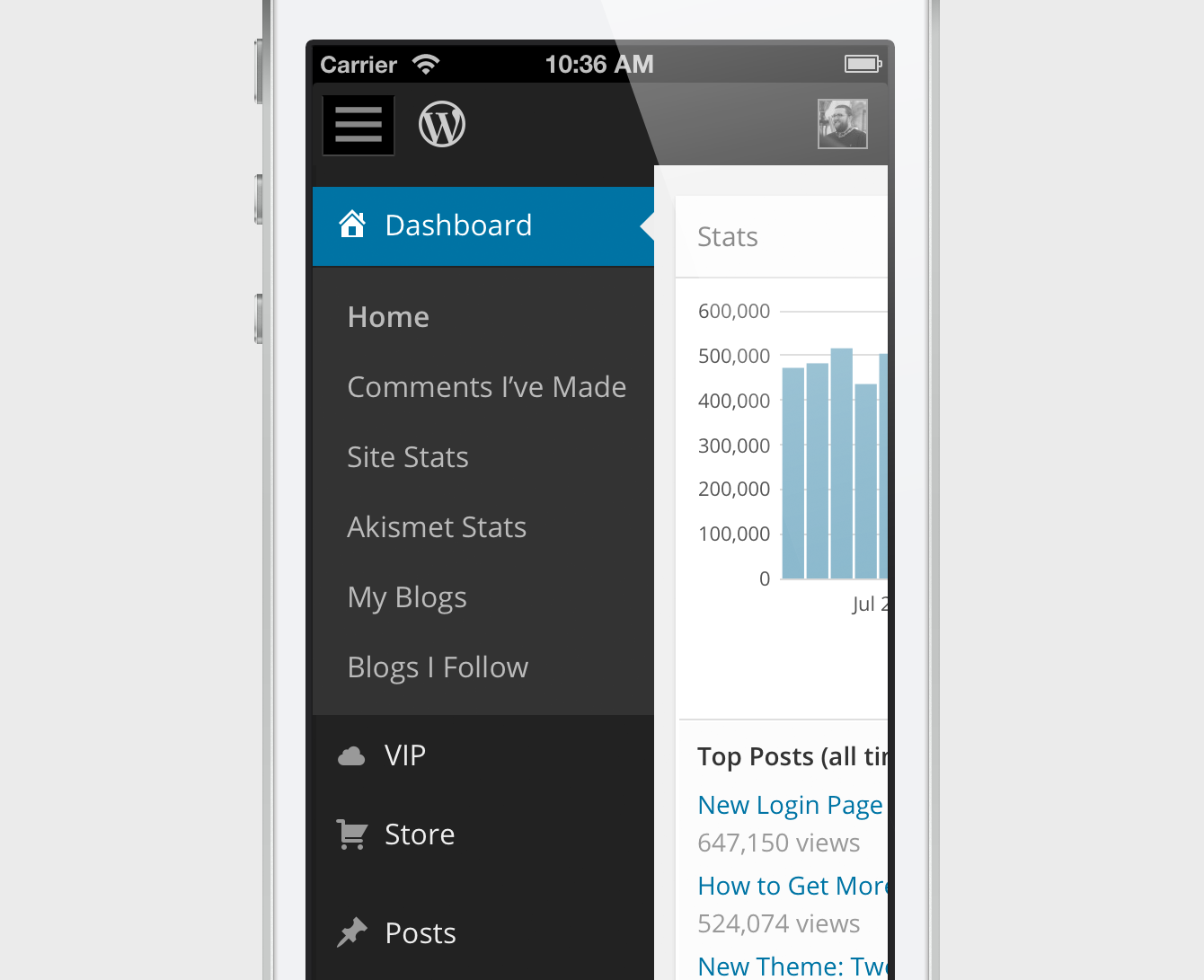
The responsive dashboard is tailored for smartphones and tablets.
We hope the redesign makes creating things with WordPress even more enjoyable.
Special thanks to the early adopters who took the new dashboard design for a spin and took the time to share their feedback — your thoughts and ideas were a big help as we iterated on the design and fixed bugs.
- June 17, 2013
- Dashboard, Design, Mobile, WordPress.com

Awesome! I love this new theme. Just a tiny bug on the login page, the WordPress logo looks strange.
Thanks a lot for this new design.
LikeLike
Thanks for letting us know! We’ve fixed that up.
LikeLike
it will make me love wp.com more than before, great!
LikeLike
Reblogged this on Rosa Aversa.
LikeLike
Please, please change it back. Cannot read mid grey on a black background.
LikeLiked by 1 person
We’ve taken care to make sure the text is high contrast — it’s actually a very light 10% grey. You can help us make adjustments by sending us a screenshot of what you’re seeing. You can upload it to your site’s media library and send us the link here: http://en.wordpress.com/admin-feedback/
LikeLike
Reblogged this on when light flickers.
LikeLike
Thanks for the update – mainly for the tablets and smartphones since I mainly start many of my draft posts on those devices because I’m always on the run. Can’t wait to see it (especially since I’m typing away on my phone on my way to an appointment, ha, ha)!
LikeLike
Reblogged this on instalifeblog and commented:
that is why I noticed something different! Nice! simple yet elegant to look at!
LikeLike
I don’t like the black frame! Like a funeral all that black!! Could you please make it changeable back to that clean white, thank you.
LikeLike
Love the new dash-board design! Thank you!!
LikeLike
Woohoo..Looks dope 😀
LikeLike
I’m, am I the only one who doesn’t see the activation button for responsive design? I’m in my admin profile under the dashboard but its not there.
LikeLike
Not just you — we had a temporary glitch there. Should be fixed now. 🙂
LikeLike
Yes, I see it now. Thanks!
LikeLike
Good Job!
I like this
LikeLike
The Open Sans font is not helpful to read them on my monitor. It looks slightly too. Is a medium font available in the future after further comments regarding this font?
LikeLike
Briefing_Admin_Norrette has a point.
Most of the “white” fonts are manageable with enough contrast but the few listed under “Dashboard” are more gray (Comments I’ve made, Site stats, Akismet Stats, My blogs, Blogs I follow)
Why not just make them all lighter/”whiter” so the contrast is stronger (and easier for some to read.)
White font on black is striking – but can be hard on eyes
LikeLike
Beautiful? *scoff* I hate the fact that this was forced on us. There should be an option to have either this or the BETTER old version. Please revert it back. This is absurdity that we are forced to follow this like sheep.
LikeLike
I would like to have the old one back. For someone like me, who is nearsighted, the black-grey contrast and the reduced typeface is a disaster.
LikeLike
Drop us a note at http://wordpress.com/admin-feedback/ — we’ve taken care to actually increase contrast in the new design. We’d like to get some screenshots of what you’re seeing, as readability varies widely depending on your browser and operating system.
LikeLike
Hey you know something? Thanks for putting the Stats back on the Dashboard!
LikeLike
Thanks! But Stats should always be visible on the dashboard. If you don’t see them on yours, click the “Screen Options” tab in the upper right corner, and make sure the checkbox next to “Stats” is checked. For more: https://wordpress.com/support/screen-options/
LikeLike
Reblogged this on The Techno Geeks!.
LikeLike
I was opted-out earlier but you opted me in on your own. Now I cannot find the option to opt-out again (there are multiple Profile links in Dashboard, where exactly am I looking?).
WordPress News is sadly not very transparent with all the background changes you made (so what if they are minor). I just noticed that you have couple of trackers and now providing options to opt-out. This is the kind of things you enable in the background without informing properly. It just makes people wonder what else is enabled or available which we are not aware of? Is there a place on your system where we can see all the minor/major changes you make? As stated above, I do not think your News section provides each and every change information.
I would appreciate if you take me to the section where i can opt-out of your new dashboard design.
LikeLike
Sorry to hear you’re not a fan of the new look. There is no opt-out available though; when we asked for your feedback back in April we mentioned that we’d be enabling the new design for everyone later this year, and we’ve done that now. We’ll continue to read and take your feedback into consideration, though.
LikeLike
Hat dies auf Liebes Tagebuch….. rebloggt und kommentierte:
It is really beautifull and now touchable….
LikeLike
Simply Amazing! I find the new look very elegant and classy. Thank You WordPress. 😀
LikeLike
Thank you WP people for making the admin stuff (eg widgets) easier to read by adding some contrast to the text. A good move 🙂
LikeLike
Nobody has asked any changes. These changes are unnecessary and reduces the visibility of work.
LikeLike
I’m i guess what you would call a casual user and appreciate the end-user friendly design of this interface. Nice job!!
LikeLike
I like the new look. Seems clean and fresh. Thanks!
LikeLike
I really don’t like that when I’m writing a post, the side menu has to be moused-over to see what those icons are for now. It just seems like a pointless change. Not to mention that all the type is now oversized. That’s not helpful unless you have a vision problem, and if you don’t, it’s distracting and means more scrolling to find what you want. For your next “makeover”, I would LOVE to see you make the area which you actually write a post in much bigger. It’s such a small window to write in. You’ve got all these huge (and much bigger with the new change) side menus, but where you write is tiny. Very annoying when writing a long post. Wish you guys would spend more time improving performance rather than fussing with aesthetics.
LikeLike
It sounds like you minimized your side menu, click the icon that looks like this: http://cl.ly/image/2m1U002w3u2l
If you’d like more room to write, try distraction-free writing mode: https://wordpress.com/support/distraction-free-writing/
LikeLike
It’s still very similar, just better 🙂
as me and another fellow nail blogger say: “wordpress til we die!”
best platform ever!
LikeLike
That’s just what we were going for. Glad you dig it. 🙂
LikeLike
The new dashboard looks like an enhancement while keeping the clear organization and helpful tools we all love.
Might I ask a question regarding my own visual hindrances? I often find it difficult to read white text on a dark background–though the sparing use of it in this menus example here looks to be okay for me. But I do wonder if there is a way for me to increase the font size of the menu labels? Is that something I do as a WordPress preference or a browser preference? The zoom in feature means that aspects of the screen are lost. So that is why I wonder if there is an “all over” setting I might change.
Thanks!
LikeLike
Hi Gratiana — thanks for the thoughtful feedback. We don’t have the ability to adjust the menu label fonts specifically. Depending on the browser you use, you may be able to use Control + (or Command + on a Mac) to zoom the text without changing the layout. We’ll keep this in mind for future enhancements, though.
LikeLike
look forward to exploring it. Thanks for your hard work. DAF
LikeLike
For some reason the design change also affected the alignment of the images in my old posts. Images that were aligned to the left are now aligned to the right in the post, but not in the post editor.
Also, the menu items are not visible (grey on grey) in the post editor screen.
LikeLike
Hi Noam — thanks for reporting this; the alignment of your images should be back to normal now. I couldn’t reproduce the problem with menu items not being visible — if you’re still seeing that, if you would, please upload a screenshot and send us the link at http://wordpress.com/admin-feedback/ Thanks!
LikeLike
Thanks, the images are indeed back to normal.
The menu items are still grey on grey when editing posts so I’ve uploaded a screenshot, as you requested.
LikeLike
I noticed this earlier this morning, but have not had a chance to explore all the changes.
LikeLike
“Oh-so-lovely”, or not, Open Sans typeface, why “fix” what isn’t broke?
LikeLike
I must admit…the dashboard is lovely.
LikeLike
It looks Mac-like! Not too much stupid colours!
LikeLike
Reblogged this on when light flickers and commented:
Love this. Looks great!
LikeLike
Reblogged this on Visual-i Gadget Reviews.
LikeLike
Unfortunately, the new dashboard is not working properly for me. I cannot delete the Spam I receive, under Settings the Reading section is blank, and the Categories section under New Post is also blank.
LikeLike
Hi Alexandra — it’ll help us pinpoint the problem if you could upload some screenshots of what you’re seeing and upload them to your blog, then send us the links here: http://wordpress.com/admin-feedback/. Please also let us know what browser version and operating system you’re using. Thanks!
LikeLike
MUCH better now! Thanks.
LikeLike
The overall look is very nice, but being extremely myopic the black background, light font is difficult to read. A screen shot would not accurately depict to anyone else what I see, which is fuzzy text.
LikeLike
I’m completely in love with my new dashboard. The orange notification alerts everywhere are the best thing for me! hahaha
LikeLike
I was in the middle of a post when I saw the change. I must say, the new dashboard is beautiful!
LikeLike
[ Smiles ] Matt, I LOVE my dashboard’s new look. Please let the entire engineering staff of Automatic know that I am truly pleased!
LikeLike
I have to admit, there’s been a change or two WordPress has made that I am not a fan of, but this one is nice. This is readable and simple. I like simple. Thank you.
LikeLike
I swapped themes last night and I thought the dashboard changes were because of my theme change!
I like the open typeface. I prefer sans serif fonts and find them easier to read. Now, if ONLY you’d add more text formatting functions! Formatting in Word or something else, then copying produces ugly errors, Not worth it. More options in text formatting would be a great gift! Meanwhile, this is a nice look. Easy to read.
One thing: It is not even close to WYSIWYG. The headers are very off and display at significantly different sizes (some much bigger, some smaller) in the post than on the dashboard. Is there anything you can do about that?
LikeLike
Thanks for the feedback — we definitely understand your frustrations with the post editor; it’s something we’re in the early stages of working on.
Regarding the inconsistency between your visual editor and what you see in your theme — some themes support Editor Styles, which makes the visual editor in your dashboard an exact representation of what you’ll see on your site. Unfortunately not all themes support this, but we’re working to add it to more of them. You can see a list of all themes that support editor styles here: http://theme.wordpress.com/themes/features/editor-style/
LikeLike
I’ve been using the beta version and still have the same complaint: The black looks sleek, but every designer I know will tell you reverse type is harder to read and therefore never the best choice. Still, it’s only a menu, not text blocks, so I’m getting used to it. Would appreciate some color options like before; perhaps one without the reverse type.
LikeLike
Some nice features here, in terms of hiding things and creating more space on the screen.
I don’t get why, when I click on my user name in the upper right, the drop down window include my username twice but that is not a big deal.
LikeLike
I absolutely love it!!! It looks dressy, fresh, clear and so much more!!
LikeLike
Reblogged this on Alisha Lambert and commented:
Important info for all you WordPress.com users
LikeLike
I am sorry, but I disagree of this change.
Ok, so the font looks pretty, and now there is a new look – but expect your computer to become a fire hazard as your CPU is at full blast when you are trying to write one sentence and have to wait like a minute to see your thought appear on the screen.
Style should be behind substance, I want something to be fully reliable to get my thoughts and stories out in a timely and urgent manner. That’s what I say is “life”. Life is about doing something in a timely manner.
Please all devs understand that many systems are still older machines – whether you like it or not. Please take that into consideration instead of telling me I should replace my machine to an iPad just for the sake of change. If you want to say my single core mid line CPU with about 1GB of ram running on 4 year old OS is old for your standards, well tough, I am the user and I should a right have a say on how I want WP.com to run!
I think many people that do WP are under the age of 30 who have no practical knowledge of the old mainframe systems or have studied Information Systems (not IT); I’ll give you an IS 101: UNDERSTAND YOUR USERS! Customers or Users Come First, Ego Distant Second! If you can’t master that skill, I am sorry but you will have unhappy users who will have to have a fire extinguisher handy in case my laptop catches on fire because some dev wanted to make the site look “prettier” and not reliable.
On point, I am a user that wants to blog and get the thoughts out in a timely fashion; by focusing on looks, this puts my hard work into back burner because of poorly designed apps.
In the real world, if something fails, someone looses their job. I hope someone will loose their job if this new look is going to be more painful for users down the road.
Sorry to disappoint,
Steven
LikeLike
Thanks for the feedback, Steven. Our new design doesn’t actually include any new javascript or other code that would explain a significant change in performance, but we’ll look into this and try to reproduce the problem. If you’d like to give us more specifics about your setup, send us a note at http://wordpress.com/admin-feedback.
LikeLike
Surprisingly I have adjusted to the change faster than I had expected.
My “newer” machines were able to handle the change, (both a 2nd gen MacBook and an HP notebook both dual core CPUs running at 2GB and 1GB RAM respectively) however a 7 year old desktop didn’t take the change well (a single core P4 @2gz /1GB) albeit its running Windows 7 that doesn’t perform well. I was able to write some posts on Sunday with no issues but yesterday it was very laggy (and frustrating too.)
I’ve not been a fan though of the frontpage/stats page/reader. To me it is cluttered both visually and CPU intensive. I always try to use the backdoor pages such as my admin pages to avoid using the CPU intensive frontpage.
The darker colors make the font more legible to read, one positive.
Thanks for being upfront about the status quo of the code. I still think it’s necessary for all developers to ensure you use the least amount of code and the least amount of system resources so these apps can run on many devices as possible young or old machines/devices/etc.
Thanks for allowing me to express this
LikeLike
I switched months ago to try it out. Didn’t find it any better, but as it was obviously going to be enforced, might as well get used to it.
Seriously, who is writing your copy? Beautiful makeover? Deploy improvements? Oh-so-lovely?
Three beautifuls in one short post?
And given some of the responses, how many people on our design team are over 40? Or are visually challenged? Or know anything about graphic design – from a reader’s perspective?
My view? No better. Didn’t need fixing. I can live with it. It’s not a beautiul improvement though.
LikeLiked by 1 person
Love the changes! Thanks for all the subtle updates. Now just wishing for faster “blogs I follow” response on mobile;)
LikeLike
Very nice, highly impressed! So easy on the eyes, great job WordPress!,
LikeLike
Well, I remember feeding back that the Open Sans webfont is horrendous on low resolution screens that do not have anti-aliasing enabled. I requested an option to change the font back to the old font, which works nicely on such screens — did this option make it into the final?
LikeLiked by 1 person
Love the updated look!
LikeLike
I HATE the new design. It looks like windows 8! I hate it!
LikeLike
I absolutely love the new design, don’t understand why people complain about it.
LikeLike
As with all things, it will take a little while to get used to the change, but so far it looks really rather good. Love the updates WP, keep ’em comin’! 🙂
LikeLike
So far, so good. I’m loving this design.
LikeLike
Love the responsive dashboard — fabulous, thank you!
LikeLike
Nice – it took me a moment to adjust but I’m liking it now! I don’t seem to be able to find my profile in order to opt in to the responsive stuff though – can you give me directions?! Thanks!
LikeLike
Thanks! Give this link a try; it should be the first option under Personal Settings. https://dashboard.wordpress.com/wp-admin/users.php?page=grofiles-user-settings
LikeLike
Reblogged this on SOCIAL U.
LikeLike
Looking great.
Now, if we could only create folders in the media library by name so we can sort things that way. It would make life so much easier.
Thanks.
Bob
_____
LikeLike
This is completely disgusting! I cannot see it on the browser of choice in my household and will not use other browsers. I voiced my opinion before and was told to use another Browser. Your reputation for good Customer Service has been completely destroyed in my opinion.
LikeLike
I like the new look more than the old one!
LikeLike
Thanks for your help, Matt! 🙂
LikeLike
I thought there was something different when I logged in today – very nice!
Thanks to all concerned
David
LikeLike
I do not like the black background for the main menu. The menu’s visual weight is much too heavy now and overwhelms the actual working area of a page.
LikeLike
You must get used to use that new version, but so far it is good looking! Thanks, good to have smth new)
LikeLike
An “A+” from me.
LikeLike
Reblogged this on Lifesfatefulway's Blog and commented:
MANY THANKS!
LikeLike
I noticed that something looks different.
Thanks!
LikeLike
Beautiful? No more or less so than before?
Less use-friendly? Yes. The unnecessary change to larger font sizes (negating eyesight problems by making them very thin and poor contrast) means lots more scrolling around – clearly nobody developing this was using a 13-inch Macbook or they would have worn their scrolling fingers out! Not very helpful.
It is a shame there is not a toggle button to go back to the old scheme, which appears to have had exactly the same functionality, but did not waste so much precious screen space and therefore necessitated less scrolling.
LikeLiked by 1 person
It is a wonderful surprise I had! Thank you!
LikeLike
I’m just new to the blogging world….but I do like the new dashboard…now I can find dashboard options much easier. Black does seems to be a bit overwhelming though…perhaps a lighter shade of black?
LikeLike
Great, I think the new design is terrific! The left bar being in black makes the dashboard look pretty cool and I think the fact that white and black are opposites help make the design work. Great job!
LikeLike
I’ve used the trial version when it was launched. Simply awesome! And the smartphone, it is also amazing!
Nice work, Matt!! 😀
LikeLike
I tried to access this new feature but I can’t find Profile on my dashboard and can’t find the link to get this new feature as you suggest. I have the latest WP. Also no stat feature is listed. What’s missing?
LikeLike
Try this direct link to your profile settings page: https://dashboard.wordpress.com/wp-admin/users.php?page=grofiles-user-settings — and just to be clear this is just for WordPress.com blogs. If you host your own WordPress blog elsewhere you can activate the new design by installing the MP6 plugin.
LikeLike
🙂 I like this … Thank you 😉
LikeLike
I have been using it for some time now and my thumb is up for this improvement. Though I do not cotton to black I have found that the contrast and readability is much improved and the clutter has been reduced.
LikeLike
How about combining the black bar with the blue one on the stats page?
LikeLike
The new look is great. Still getting used to it though but everything is working fine!
LikeLike
Very nice! It looks great on my PC, and I’m looking forward to checking it out on my Nexus 7 later this evening. Well done!
LikeLike
Just want to say I like this new and slick design. If anything, I feel the black color has a bit too much of a contrast to the white in the Dashboard. It tires the eyes.
LikeLike
Alas , still ignoring the growing population of Mac OS X users – “It should have a responsive design that’s tailored to PCs, tablets, and smartphones.”
LikeLike
The new design was created on Macs. They’re my favorite kind of PC. 🙂
LikeLike
I apologize. As a Software Engineer I think of Mac as being outside the “PC” box.
LikeLike
No apology necessary! I updated the wording. 🙂
LikeLike
I love it. It’s like releasing a new book in school.
LikeLike
REALLY like the redesign ♡ The black is awesome (my blog is dark as well so it’s probably why I like it so much). I look forward to fiddling around with the responsive dashboard.
LikeLike
When is this hitting self-hosted?
LikeLike
No news on that yet, but stay tuned to http://make.wordpress.org/ui/ for the latest.
LikeLike
Love your stats – 500,000 some days, oh 600,000 the next. Now THAT’s a vision!!! Don’t know anything like it!
Well, I’ve woken on a Tuesday morning here in Melbourne Australia and see you’ve been working through the night. I was recommended by a friend of sorts YEARS ago to blog – to go on WordPress. I’m so glad I chose YOU.
Just great stuff, as always.
LikeLike
I love my new dashboard. It looks so tidy and clean. Thank you!
LikeLike
I appreciate the clean new look of the dashboard. Thank you for all the effort that goes into making WordPress our home away from home.
\o/
LikeLike
I actually logged in to WordPress to check my own blog before seeing the update posted on yours, and was pretty excited about it. I’m loving the new look! Very clean and lots of space.
LikeLike
Love the new design! Clean and neat but not too different from the original – great job avoiding discombobulation.
LikeLike
I changed over as soon as I could. I like it a lot. Sharp and clear. Thank you!
LikeLike
Sometimes – on the iPad – the black sidebar snaps over to the right side of the divider between sidebar and content. Otherwise – like it fine so far.
LikeLike
I absolutely love the new design!
LikeLike
Loving the new design!
LikeLike
I don’t like it. Change it back.
LikeLike
What’s with all the Blech Noir? Some kind of nostalgia for MySpace?
LikeLike
Good work! So much easier on the eyes too!
LikeLike
I especially dislike seeing the dashboard menu off to the side while I am writing. Is there no way to eliminate it or at least make it less obvious?
LikeLike
Hi David — if you click the “Collapse menu” link at the bottom of the sidebar, it’ll hide the text labels and just show the menu icons, with dropdown submenus on hover. I also highly recommend Distraction-Free Writing mode when you need to focus: https://wordpress.com/support/distraction-free-writing/
LikeLike