Mobile theme gets a facelift
If you use our default mobile theme, you’ve noticed that we recently gave it a new design. We’ve also added two new options to the theme to give you more control over your mobile site’s appearance.
(Not using the mobile theme yet? To activate it go to Appearance → Mobile and select “Enable mobile theme.”)
Open Sans font
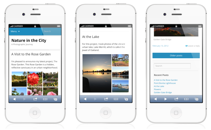
A major goal of the redesign was to make the mobile theme even easier to read on your mobile devices. We’ve updated the font to Open Sans, the standard typeface across WordPress.com. Open Sans is elegant and modern, and it offers an excellent mobile reading experience.
Aside from the font, we brightened up the blue (it’s now the standard WordPress.com blue), and moved the menu and search box to the very top of the screen. This leaves more room for what’s important — your content.
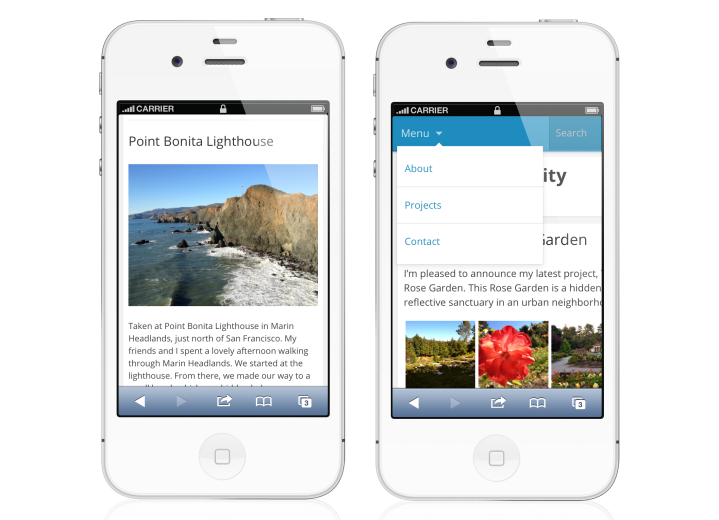
New options

Two new mobile options
Does your static front page look blank on the mobile theme? It doesn’t have to anymore. You can now tell the mobile theme to always display posts on the front page. Just go to Appearance → Mobile and select “Always show posts on the front page.”
We’ve also made it easier for you to control the appearance of your header. The mobile theme honors the color you’ve selected for your Custom Header at Appearance → Header. However, some header text colors are too light to read against the mobile theme’s white background. Now, you can turn off the custom header color just for the mobile view. Go to Appearance → Mobile and select “Turn off the Custom Header text color? (select “Yes” to use the mobile theme’s default black header text color).”
Jetpack
If your site lives on WordPress.com, the updated mobile theme is already available to you. There is nothing to download, just turn it on at Appearance → Mobile.
However, for those of you who are running a self-hosted WordPress.org site, you can access many cool WordPress.com features — including the mobile theme — through our Jetpack plugin. The freshly updated mobile theme is available with the latest Jetpack release, so grab yourself a copy and take it for a spin.
Have fun
Many of our themes are already responsive, with layouts that adjust gracefully to smaller screen sizes. If you’re not using one of our responsive themes and you want to optimize your site for mobile viewing, give the mobile theme a try. Most of all, have fun!
- March 29, 2013
- Mobile, New Features
 WordPress.com News
Does anyone know if there is a way to determine (or get a clue) as to how many views are from a mobile device?
LikeLike
Nice, thanks for the update and effort.
LikeLike
Wow..these are sweet!
I’m trying to get someone over at Apple to get me an iPhone to check out. I hope they do it soon. I’d like to see what my site looks like with this theme.
Thanks!
LikeLiked by 1 person
Awesome new mobile theme, guys! You guys did a fantastic job on this theme, and best of all, it looks really beautiful and fantastic on my new 5th gen iPod touch! 🙂
LikeLike
Mostly LOVE the new mobile theme! I had not been using the prior mobile theme because I didn’t like how it looked and the desktop theme I am using, Twenty Eleven, is responsive.
My only suggestion for improvement is some kind of alternative to having all of the sidebar content for themes with two or more columns buried at the bottom, where, I’d guess, hardly anyone will ever find it.
Perhaps the menu could have a link to the sidebar content?
Otherwise, REALLY nice job!
LikeLike
Glad you like the mobile theme, and thanks for the suggestion.
LikeLike
the mobile theme looks amazing!
LikeLike