Transform Your Site with a Custom Background
Recently, I highlighted blogs and websites displaying custom colors and custom fonts, which you can enable on your own site with a Custom Design upgrade. Today, let’s look at a free way to easily transform your site: a custom background.
If chosen carefully, a custom background can reveal a lot about your site’s focus, as well as your overall aesthetic. I asked a few users about the backgrounds they’ve uploaded to their sites, and how they chose them:
Gherkins & Tomatoes, Biscuits & Gravy
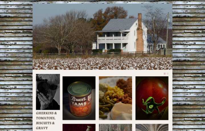
Cynthia, the writer and photographer behind Gherkins & Tomatoes, Biscuits & Gravy, focuses on the cuisine and rich history of the American South. Her background caught my eye immediately — it enhances and unifies her image-oriented site.
Gherkins & Tomatoes, Biscuits & Gravy
Tell us about your custom background. Why did you choose it?
I downloaded this background from GRSites, which has all sorts of textures. I love the tiled effect with my customized Gridspace theme. I chose this image because it looks like a lot of buildings in the American South, where the weather wreaks havoc with paint on exterior walls, especially old out-of-the-way restaurants. Since my blog primarily covers the food history of the American South, I wanted something that conveyed the time-worn look of the white frame houses so common in the American South, the “homeplace” where so many people remember eating grandma’s cornbread and soup beans, sugary pies, and fluffy cakes.
Got any tips to share with users who want to upload a custom background?
If your blog contains a lot of photos, as mine does, be sure the background doesn’t detract from your main content area. You don’t want things to look too “busy.” The background design should complement everything else that the reader sees. It should also convey something about your blog’s main focus.
I’ve also played around with quite large files for backgrounds and these also work well, provided there are large expanses of color or shapes in the image. Why is this important? If the larger image has too much detail in it, it will tile in such a way that distracts the reader from what you’ve featured on your blog. If, on the other hand, your blog content doesn’t rely so much on photos or graphics, you can use a pretty busy background.
Thanks for your tips, Cynthia!
A Weirder Fetish
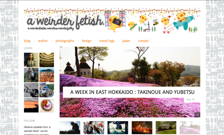
The front page of Vanessa’s travel blog, A Weirder Fetish, is packed with photography, from the large featured images in the slider to the thumbnails down the sidebar. Her whimsical, illustrated header is colorful and prominent. So, I like her choice of a subtle, light gray pattern because it doesn’t overpower, yet still adds texture and contributes to her theme of wanderlust and exploration.
A Weirder Fetish
Tell us about your custom background. Why did you choose it?
I chose a group of houses as my custom background, so that the tiled effect would display rows and rows of a closely-knit populated town. It creates the sense that every single place in this world is connected to each other in one way or another — that we are not too different after all. It has always been my dream to travel to places like Italy one day (the streets of Naples, for example). This background also serves as a constant reminder to achieve this dream!
Got any tips to share with users who want to upload a custom background?
Your custom background shouldn’t stand out too much because after all, the main content lies in the posts you upload. A tiled custom background should be kept simple and spaced out so it allows for comfortable reading. Start with something close to the theme you’d like to present. More importantly, choose imagery you really love, for you are possibly the number one visitor of your own blog.
Great advice. Thanks, Vanessa!
Now, it’s your turn!
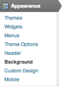 Most of our themes on WordPress.com allow you to upload a new background image, select an existing image from your Media Library and set it as the background image, or select a color. Go to Appearance » Background in your dashboard. If you don’t see this option, your current theme does not support the custom background feature. But don’t fret — in the Theme Showcase, you can browse the themes that support custom backgrounds.
After you’ve uploaded a background image or selected one from your Media Library, you’ll see Display Options. You can:
- Position your image on the left, center, or right of the page.
- Set your image so it repeats (the “tiled” look that Cynthia and Vanessa describe above) or doesn’t repeat — you can tile the image vertically and horizontally throughout the entire page, tile horizontally only, or tile vertically only.
- Set your background to “scroll” with your content, or stay “fixed” in place when a viewer scrolls down the page, as shown on both Cynthia and Vanessa’s blogs above.
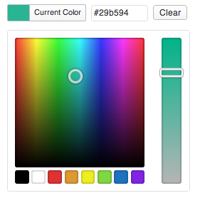 If you don’t want to display an image but still want to transform your background, play around with the color wheel. If you know the exact hexadecimal value of the color you want to use, enter it directly into the color field.
If you prefer to pick a color from the color wheel, click on the Select Color link beside the box, which opens up the color wheel. When you have found the color you want, click Save Changes.
Need inspiration?
Here are examples of other blogs with custom backgrounds:
- Design by Lulu: A pretty site with a matching patterned background and pastel header. In fact, Lindsay’s background is the same image on her business cards. This visual consistency is smart — it makes you and your brand recognizable.
- One Theology: A site focusing on discussions and ideas about theology and philosophy. The black-and-white scheme and uppercase font in the header create a bold and sleek site, and the lettering displayed in the background enhances the design.
- New Girls About Towns: A blog by two gals, Ellie in London and Sara in New York. They take advantage of the Confit theme’s full-page background with bright, playful illustrated city icons that match their site’s custom header. Note: With Confit, an individual page can have its own background image (to do this, just set a featured image to that page).
Don’t have your own image to use and want pattern and texture ideas? In addition to Cynthia’s suggestion, GRSites, poke around on these sites:
- February 12, 2013
- Customization, HowTo

Thanks for this article. I changed my background to the Low-contrast Linen look from Subtle Patterns and I really like the results.
LikeLike
I’ve long loved the usability of custom backgrounds because I insist that my sites fill a big screen.
For the Lone Star Miata Club- I build a background that looks like a dirty garage floor with lots of tire marks.
http://lsmiata.com/
But for my Alaskan Outdoor adventure series, I went the opposite way- I used a custom background and header that match and extend the same look from our print campaign. It’s seamless.
http://waotbp.wordpress.com/
LikeLike
Thanks for this info.
I think I like the background I currently have though.
What do you think of it? I call it boomerang.
LikeLike
“Boomerang” is certainly a good way to describe it. The pastel blue-greenish shade is easy on the eyes!
LikeLike
I wanted my background to be as unintrusive as possible, but still add a little texture to my page. I made one, and for the time being, I’m pretty pleased with it.
LikeLike
I customised my colour when I started my blog. Although I changed my theme from Liquorice to Triton lite I kept the same colour to carry my ‘brand’ forward and be recognisable. I like having a plain background that doesn’t detract from the content.
I had a look at the GRS site and there are some lovely backgrounds. I particularly like the music ones but I would only use one of those for my music posts. Then I would need a different one for walking and one for writing………..
Feel free to let me know if you think an image would enhance my blog.
LikeLike
Thanks for mentioning my site, One Theology. I used some free logo software called Laughing Bird to create my background. Your tips for customizing templates have also been helpful!
LikeLike
Sure thing, Chad — really love the effect of your chosen font and the background — very sleek!
LikeLike
I know wordpress and a google search or more can offer a great variety of backgrounds BUT if you still haven’t found your dreamed background, here’s a tip. Use http://pixlr.com/editor/ to create your own. Super easy, you can collage own images, from the web, choose a color theme…use the 1024px image (for my blog to just create the black sides I used 1343px and 500px long) play with it. Good luck!!
LikeLiked by 1 person
Great — thanks so much for taking the time to leave this tip. I use Pixlr for quick and fun photo edits, and you’re right that you can create your own backgrounds/images, too!
LikeLike
Thanks for the suggestion. I had no idea I could do that for free – I guess I should explore my dashboard a bit more! It’s looking like I may need to change my theme as it doesn’t work well in older browsers, but once I settle on a theme, I will definitely look at custom backgrounds.
LikeLike
I have so much fun playing with backgrounds on my blogs. I have 14 different blogs, one for each different region or country in the world where I travel, and I always try to capture a mood for the culture using different themes, a unique background image and a headline that tells something about the country. This is one of many WordPress features I LOVE. 🙂
LikeLike
I actually used that same site (with the accompanying site reference as per their rules) and it slowed down my site so much that I took it off and went back to a custom color. But I plan on putting a wooden floor back on my site (this site being twenty eleven which allows you to do fiddle) as I’m a designer at heart. Great article. Thank you and love your site!
LikeLike
Hi Cheri,
I spread this one across my networks earlier today. This tip is quick, easy to accomplish, and you don’t have to develop mad smartypants geek skills to figure it out. It’s a sweet way to add some zazz to your Dullsville blog decor.
LikeLike
I’ve used a gif for my background with has flashing hearts / stars but not TOO flashy I think, or at least I hope! Do you find it distracting?
LikeLike
The pink background matches the playfulness of your site and the heart/star motifs complement, too. I’d say keep the color pastel and don’t ever make it too bright, and the details within the background should be minimal/muted, too.
LikeLike
We’re a show choir and wanted something sparkly to reflect that, and yet not something that would be distracting when viewing our site pages. I chose to take a texture (actually a Photoshopped image of carpet, believe it or not) and to tile it across the top only. I picked a solid color from the texture to continue the background. That way, you get the burst of sparkle when you first visit a page but by not having it completely tiled, it keeps its “pop”. http://houstonchoralshowcase.org/
LikeLike
I’ll try to use this theme to one of our clients. This theme will be good for those who wanted to change background color from time to time.
LikeLike
Hi Cheri,
I’d appreciate your feedback or anyone’s on the custom background I designed for my Watson theme, which by the way, was really easy to upload. I’m wondering if it’s too busy, distracting. I think the white pages for the post off-set it enough.
Also, I tried to pick an image related to my theme, intrinsic learning, and selected a hand-drawn tree form which may or may not convey that.
I’ve noticed that the photographs I use in my slider need to Not clash with my background, so it has limitations in that respect.
LikeLike
Hi, Kristin! If you’re looking for feedback from others, come visit The Daily Post (https://wordpress.com/dailypost) – each Sunday, we have an open thread where you can ask for feedback and get responses from lots of other WordPressers.
LikeLike
‘made-it-look-easy’ type article.simple language and lots of fun…
LikeLike
Good advice, I think simplicity is a big factor when choosing a background, I’ve used little avatars I made of myself and lightened the tone as not to draw too much attention – pretty funny though!
LikeLike
That was really usefull tnx !
LikeLike
This is really helpful… Thanks!
LikeLike
I also like the textures at GRSites. For a change, I’ve removed the custom background on my blog but I use their textures on my Twitter account. They tile very nicely! Tip: to find the textures and backgrounds, you need to look in the Archive section of their site. http://www.grsites.com/archive/textures/
LikeLike
Awesome — thanks for the tip, Patricia.
LikeLike