WordPress 2.7 Navigation Options Survey
**Note: This survey has closed.**
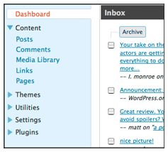 WordPress 2.7 is currently in development and as some people already know, it features a revised layout with a left-hand navigation column that was designed in response to user feedback regarding the use of screen real estate. Because the navigation came straight from the Crazyhorse prototype that was developed quickly for usability testing, it is still a work in progress.
Navigation sections and labels are being decided now, and as usual there are lots of good ideas floating around. As part of the mission to increase user involvement in design decisions, we’ve created a survey intended to give WordPress users the ability to play a part in deciding how the navigation options should be grouped and labeled. If you use WordPress and want to add your opinion, take the survey.
Update: WordPress 2.7 Navigation Options Survey has closed as of 04:00 UTC on Friday, September 19, 2008.
- September 15, 2008
- New Features

User participation in development like this is exactly why WordPress is the best blog provider/host out there.
LikeLike
This looks very convenient! To be honest, I like left-hand sidebars more than top sidebars. It’s about time this idea took force.
LikeLike
GREAT initiative.
Just completed the survey
Looking forward to that newer version on November 2008
Thank you !!!
LikeLike
Very cool ! 😀
Hugs WordPress
LikeLike
Thanks for letting us have input on this!
The scientifically impossible I do right away
The spiritually miraculous takes a bit longer
LikeLike
I actually like the navigation controls at the top of the screen.
Is there a way to make the location of the controls user-selectable?
Thanks for all you do!
LikeLike
usually I’m OK with change, but can you guys just leave it the way it freaking is…how unnecessary. Nonetheless, I did take the survey and chose option C.
LikeLike
AWESOME
LikeLike
great!!!!!!!!!!!!!!!!!!!!!!!!!!!!!!!!!!!!!!!!!!!!!!!!!!!!!!!!!!!!!!!!!
LikeLike
Kool!!! Thanks for letting us know 😉
😀
LikeLike
I like the new dashboard. I think it’s even better than this one.
LikeLike
very cool wordpress live!!!
LikeLike
very cool
LikeLike
Thank you for Survey & the chance of providing feed back
about the “CrazyHorse” layout. (I chose Option c for the layout.)
LikeLike
No offense but these really are not the type of improvements that most bloggers are looking for. We want improvements to the capability of our wordpress.com blogs, not boring old dashboard navigation improvements.
😎
LikeLike
Wow, cool option. This is the great deal of wordpress facilites. I like it so much. Thanks wordpress, you give me more opportunity to develop my blog with this option.
Great job! Congratulation. 🙂
LikeLike
wow it’s very easy now 🙂
LikeLike
I’m looking foreward to November and the new WordPress 😀
LikeLike
Is this going to be the new design for our WordPress dashboard, an optional design, one of the features you can buy from WordPress.org, or something different? I’m not sure what it is that your talking about, sorry.
LikeLike
Birdwhisperer: The admin tool is being redesigned in version 2.7 to make it easier to navigate and perform common tasks. The navigation design is intended to eliminate the need to leave your current screen while looking at other navigation options (currently you have to go into another section to see that section’s available options).
LikeLike
it’s really great to see inside the development process and actually have a chance for input, rather than turn up one day and find the interface has changed (and probably not to something user’s really like).
Good work!
LikeLike
nice survey. cant wait for 2.7 🙂
LikeLike
And why not let the user decide what he wants for this navigation.
LikeLike
Word press is the best blog package ever made, always updating us with the latest news, waitin for 2.7.
LikeLike
ROCKIN!
LikeLike
I agree with Dartmerc, thanks for giving us the chance for some input.
I reckon I’m going to like this too.
LikeLike
i love it! who says u cant fall in love at first sight? the right tools at the right time!
LikeLike
Wooow….
WordPress is the bestlaa
😆
LikeLike
I think it would be better if WordPress makes it user-selectable. Actually, I have no problem with it being at the top. It doesn’t make any much difference.
LikeLike
Ilah: The navigation redesign is allowing us to provide more options in version 2.7, such as allowing the user to decide which modules to display on the Write Post screen.
LikeLike
cool.
LikeLike
new menu it cool….I like it
LikeLike
WordPress 2.7 .. wow it’s fast update from wordpress 😉 good job guys
LikeLike
My request would be that we get some warning before anything new is launched. I’ve noticed that when new features or major changes happen, there are glitches and the forum volunteers are sure given a run for their money.. so to speak, since they’re volunteers.
Last time, I was able to just log out and wait out a day or so for some of the glitches to be sorted out. That was just sheer luck though. It would be nice to know (kind of like how they knock on your door and let you know before they turn off the water to repair a water main break) with a bit of advance warning, so that we can not be doing something really important (to us) when voila… everything changes.
That would be super! I think with warning, most of us can adapt to any changes that happen.
Heading to the survey now.
LikeLike
fracas: The launch of version 2.7 is expected to happen in early November. We will post announcements in advance of this date to give people some warning. We’ll also be re-working the FAQ and creating some new screencasts to help with the transition.
LikeLike
I think it’s very useful for us
LikeLike
Great job!
Will it be possible to integrate the publishing tool in the main wordpress-sites?
I would love a “login”-box as a sidepanel widget on the main page. When you log in, the login-box changes to show the 4-5 most used tools, such as “Write post”, “New Comments” etc – with a link to the Dashboard for further options.
LikeLike
That’s actually pretty cool! But it will take awhile to get used to the change if we do change it.
LikeLike
Great but i would liek more themes with navigation bars It is really useful.
Thanks
Gaby
LikeLike
Thanks for all you do!
LikeLike
Interesting!!! Cool!!! Wow!!! Amazing,
Adam.
LikeLike
wow cool…..
LikeLike
Wow is great, thank for new option 🙂
LikeLike
the new feature seemes to be more
aggregated at first sight.
LikeLike
Can we opt out of any changes if we like things the way they are? Just getting used to the new look of the dashboard and now it’s changing again. What’s the point?
LikeLike
nice ……….
LikeLike
Some category icons will help more but …wow fast improvements!
LikeLike
I agree with Ilah in making it user-selectable. I prefer the current version. What I’d like to see is the option to move or even deactivate menu items.
Smile! Gerrit
LikeLike
I don’t really see how changing the location of the navigation links makes much difference: they’ll apparently still scroll off the screen and the column may continue taking up screen space when you scroll down. This could be mildly good or mildly bad, there’s just not enough information to judge it on.
LikeLike
Hi i’m new here…Thank you wordpress God speed to all 🙂
LikeLike
I just want: better search,better search,better search,better search,better search,better search,better search,
LikeLike
Great..But we need the ability to checklist some Postings and grouping it to a category..
LikeLike
GREAT! It’s wonderful 🙂
LikeLike
PERFECT nice~
i like it~
LikeLike
It looks better and fast…
LikeLike
I will take the survey….
LikeLike
good idea
LikeLike
I prefer a sidebar instead of the top bar menu we’ve been having.
Up next, wordpress should tie down with sites Imeem so users have more choices to put music on their blogs.
LikeLike
No, but I like to navigation the one at the top
that is quite ok
Is there an option to use the navigation style we like or we are forced to use side navigation system
LikeLike
Awesome! Can’t wait!
LikeLike
Could we have an easy link to the Global Dashboard? It’s become much harder to access for those running heir own installations?
LikeLike
How about the TRANSLATION thingy???
Please scratch that off.
LikeLike
Nice, i like the sidebar navigation layout. Hope they release this version soon.
LikeLike
Wow, this is great. Thanks guys, WordPress just gets better and better!
LikeLike
good idea
LikeLike
Looks like a great revision! Thanks.
LikeLike
I loke top bar menu something like pull down menu, it will pop up when you need it.
When you put left bar menu, it stay there and take some space.
I like the idea of the menu should subtle, you don’t see them when you focus on composing your content.
Please give us the freedom of choice to use top bar menu or left bar menu.
Thanks in advance for your attention.
Cheers,
Sur
LikeLike
Since the survey didn’t ask…
The thing I do most frequently is post. I want to get right to the post page, and once I get there, I don’t want to be held up or otherwise annoyed. So please put categories and tags above the fold and to the side of the edit window.
I’d like to be shown the blog admin pages I most often go to. So, if wp.com could keep track of that, and display them prominently in the dash or in the admin bar, that would help. Perhaps the three I use most frequently?
Thanks for soliciting community input.
LikeLike
Andrew: in 2.7 you’ll not only be able to drag and drop modules on the write post screen to put them wherever you like, you’ll also be able to decide which modules should appear on your screen at all. Tags and Categories on the right side of the edit window and above the fold, coming right up!
LikeLike
nice 🙂 it sounds better than this version 😀
LikeLike
When it will come to free version?
LikeLike
good stuff
LikeLike
hahaha….love it…
LikeLike
Since I started in February I’ve survived two lots of learning curves – couldn’t we just leave things the nice way they are? Or at least give the option? As someone above said, I just want to post in the quickest time, and changing things causes delays and uncertainties. Bloggers blog! They don’t need permanent twiddling and fiddling with the look of the thing. I reckon most of us would prefer new themes or more widgets… and for myself, I don’t even need that.
LikeLike
cooool
LikeLike
coool
LikeLike
Wow! That’s really nice!!! mmm…. Free version???
LikeLike
🙂
LikeLike
YES, YES – for “menu option” !
Please do not “FORCE” a sidebar menu in your new design – not everybody has high-res monitors. At the very least, please make it so that if you use the sidebar menu format, then make it so it can be completely collapsed with a simple click (disappear). Otherwise, on lower res monitors the vertical disign will be far too invasive within the content of admin pages and cause either display gliches (perhaps within WP default admin pages, and maybe within some plugin option pages) or create an annoying need to scroll horizontally.
LikeLike
wordstretch: The shift in navigation placement comes after usability testing showed us that the current system takes up so much room on monitors with lower resolution that very little working area is above the fold by default. This is true on many laptop screens as well. The narrow left side menu is intended to provide the greatest working area on the screen possible.
LikeLike
i like sidebar from < wp 3. it more easy to manage our widget if we choose 2 sidebar theme. We don’t have to switch between sidebar 1 and 2. Just my opinion.
LikeLike
GREAT!
LikeLike
Looks Awesome 🙂
LikeLike
Cool navigator bar 🙂
LikeLike
very nice.
LikeLike
it seems the navigation will be a lot easier, i will be waiting for that.
better to keep each user pick their own preference in this ‘layout’.
but overall, wordpress is the one!
LikeLike
nice 🙂 it sounds better than this version 😀 Thanks.
LikeLike
so cool
LikeLike
That’s great! Can’t wait for it to come out.
One feature I’d love to see improve is My Comments (and a couple of other sections of the Dashboard), that only allow you to see your past history on one Page…so any comments you made that are older you currently can’t see.
LikeLike
Great, its useful 🙂
LikeLike
Thanks to everyone for their suggestions. The navigation, like the rest of 2.7, is a work in progress, and we’ll be taking everyone’s feedback into account while we focus on making decisions that will address the biggest problems in the interface and help the most people improve their blogging experience. As we address more areas of the admin tool, such as the dashboard or the new post screen, we may post more surveys to gather additional community feedback.
LikeLike
Wow..so cool!
LikeLike
Very lovely! NICE!
LikeLike
Very Good!
LikeLike
I would like to see more themes with custom headers.
LikeLike